Alamy/Ron Fassbender


Pollster accuracy. Mark Pack
To explain how this was calculated, we can look at the example of More in Common’s regular poll, which was one of the most accurate. We simply calculate the distance between the poll and the vote shares for each party and then add them all up. For example, More in Common predicted that Labour would get 39%, the Conservatives 24%, Reform 15%, the Liberal Democrats 12% and the Greens 5%.
The final vote share on July 4 was 34% for Labour, 24% for the Conservatives, 14% for Reform, 12% for the Liberal Democrats and 7% for the Greens. If we calculate the difference between the forecast and the outcomes, More in Common was 5% out for Labour, 1% out for Reform, spot on for the Conservatives and Liberal Democrats and 2% for the Greens which produces an accuracy score of eight.
Accuracy scores vary quite a lot between pollsters. The list contains five MRP polls. These big data polls are best known for predicting the results in specific constituencies using large samples. The YouGov MRP had a sample of nearly 60,000 respondents.
It is noticeable that despite the very large samples associated with MRP polls, they were not the most accurate in the list, although they did better than the average accuracy score of just under 13. At the same time this difference was not consistent. The YouGov MRP had a score of eight compared with a score of 11 for its regular poll. However, the reverse was true for the More in Common, which scored eight for its regular poll and ten for its MRP.
Why do polls get it wrong?
One of the most acute problems in polling is getting representative samples of the electorate. All survey firms are struggling with this problem since the gold standard, random probability surveys, where people across the country are randomly selected and called, have all but died out on account of being too expensive and time consuming to conduct.
Practically all polling companies now use quota samples. This involves interviewing a set proportion of different groups needed to make the sample representative of the electorate. They interview defined numbers of people from groups based on things like age, gender and ethnic background. This requires data from the census and other sources to identify the size of the quotas.
When the quotas are not filled this can create bias in the samples. This is not always a problem since weights can be used to compensate for non-response. For example, if we need a quota of 200 voters under the age of 25 for a representative sample but we only get 100, we can count the latter twice in the analysis. This is essentially what weighting does.
However, the hidden assumption here is that the young people interviewed are representative of those who aren’t interviewed. The US journalist Ken Goldstein has cited this as contributing to the failure of the polls to predict the 2016 US presidential election. He said: “Usually we assume the problem is that group X is too small, but the actual problem is that group X is too weird.”
Want more politics coverage from academic experts? Every week, we bring you informed analysis of developments in government and fact check the claims being made.
This gives rise to a serious problem highlighted by political scientist Michael Bailey in his recent book, Polling at a Crossroads. The technical term for this is “non-ignorable non-response”. If respondents and non-respondents differ and we cannot verify this from other sources, then the poll will be biased and give the wrong answers.
We can find out from the census if the quotas of young people or ethnic minorities are correct, but it will not tell us if respondents are more interested and less alienated from politics than non-respondents.
The implication is that the eve of election polls contained this type of non-response and so exaggerated Labour and Reform party support. It was very likely caused by non-respondents being more apathetic or more alienated from politics than respondents.
THE CONVERSATION
Published: July 12, 2024
The 2024 UK election campaign was dominated by discussion of the polls, from start to finish. This was partially because of the sheer volume of polls being published. We had more MRP (multi-level regression post-stratification) polls than ever before, many giving quite different pictures of the size of Labour’s lead.
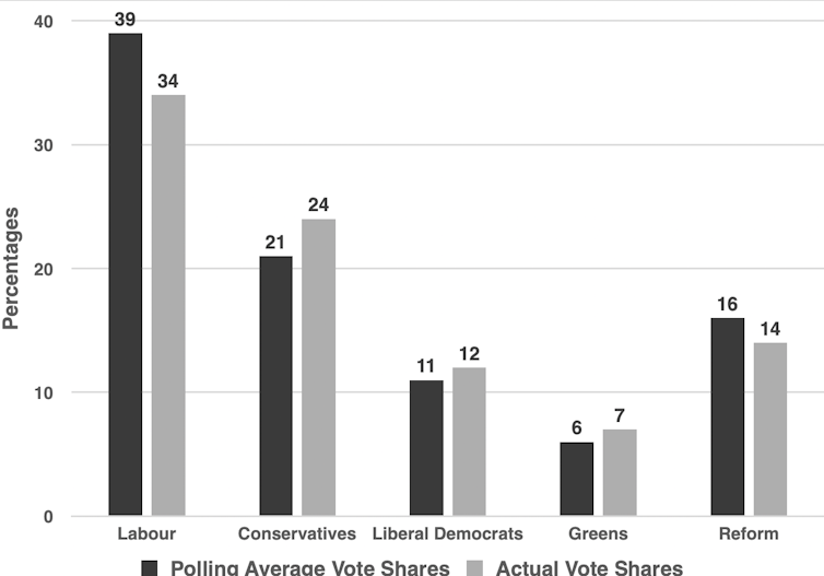
The chart below shows the average performance of 27 polls which predicted vote shares in the contest just prior to the election on July 4. The polling predictions are on the left and the actual vote shares are on the right for each of the five UK-wide political parties.
As a standard industry approximation, if the results differ from the outcomes by more than 3%, there is a statistically significant difference between the polling and the outcome. In other words, the pollsters got it wrong.
Final poll predictions and actual vote shares:

How the pollsters did. P Whiteley, CC BY-ND
Using that rough yardstick, the pollsters over-predicted the Labour and arguably under-predicted the Tory vote, although in the latter case it was on the boundary of statistical significance. The other parties were within the margin of error. To be fair, different polling companies varied in their accuracy, so we need to look a little more closely at the results.
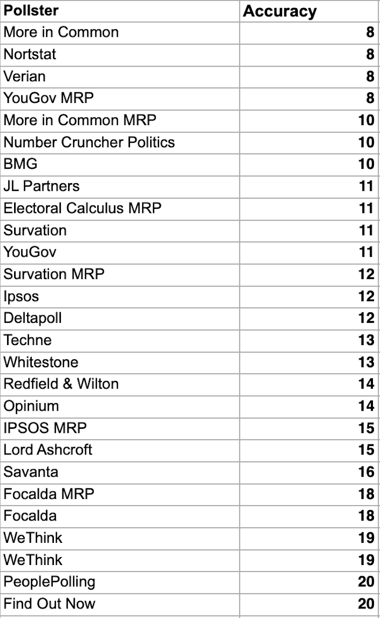
The list below shows how accurate 27 polling agencies were in forecasting the vote shares in the election. Accuracy can be measured in different ways, but the method used here is easier to understand than most others. A low score means the poll was more accurate.

Pollster accuracy. Mark Pack
To explain how this was calculated, we can look at the example of More in Common’s regular poll, which was one of the most accurate. We simply calculate the distance between the poll and the vote shares for each party and then add them all up. For example, More in Common predicted that Labour would get 39%, the Conservatives 24%, Reform 15%, the Liberal Democrats 12% and the Greens 5%.
The final vote share on July 4 was 34% for Labour, 24% for the Conservatives, 14% for Reform, 12% for the Liberal Democrats and 7% for the Greens. If we calculate the difference between the forecast and the outcomes, More in Common was 5% out for Labour, 1% out for Reform, spot on for the Conservatives and Liberal Democrats and 2% for the Greens which produces an accuracy score of eight.
Accuracy scores vary quite a lot between pollsters. The list contains five MRP polls. These big data polls are best known for predicting the results in specific constituencies using large samples. The YouGov MRP had a sample of nearly 60,000 respondents.
It is noticeable that despite the very large samples associated with MRP polls, they were not the most accurate in the list, although they did better than the average accuracy score of just under 13. At the same time this difference was not consistent. The YouGov MRP had a score of eight compared with a score of 11 for its regular poll. However, the reverse was true for the More in Common, which scored eight for its regular poll and ten for its MRP.
Why do polls get it wrong?
One of the most acute problems in polling is getting representative samples of the electorate. All survey firms are struggling with this problem since the gold standard, random probability surveys, where people across the country are randomly selected and called, have all but died out on account of being too expensive and time consuming to conduct.
Practically all polling companies now use quota samples. This involves interviewing a set proportion of different groups needed to make the sample representative of the electorate. They interview defined numbers of people from groups based on things like age, gender and ethnic background. This requires data from the census and other sources to identify the size of the quotas.
When the quotas are not filled this can create bias in the samples. This is not always a problem since weights can be used to compensate for non-response. For example, if we need a quota of 200 voters under the age of 25 for a representative sample but we only get 100, we can count the latter twice in the analysis. This is essentially what weighting does.
However, the hidden assumption here is that the young people interviewed are representative of those who aren’t interviewed. The US journalist Ken Goldstein has cited this as contributing to the failure of the polls to predict the 2016 US presidential election. He said: “Usually we assume the problem is that group X is too small, but the actual problem is that group X is too weird.”
Want more politics coverage from academic experts? Every week, we bring you informed analysis of developments in government and fact check the claims being made.
This gives rise to a serious problem highlighted by political scientist Michael Bailey in his recent book, Polling at a Crossroads. The technical term for this is “non-ignorable non-response”. If respondents and non-respondents differ and we cannot verify this from other sources, then the poll will be biased and give the wrong answers.
We can find out from the census if the quotas of young people or ethnic minorities are correct, but it will not tell us if respondents are more interested and less alienated from politics than non-respondents.
The implication is that the eve of election polls contained this type of non-response and so exaggerated Labour and Reform party support. It was very likely caused by non-respondents being more apathetic or more alienated from politics than respondents.
Author
Paul Whiteley
Professor, Department of Government, University of Essex
Disclosure statement
Paul Whiteley has received funding from the British Academy and the ESRC.
Professor, Department of Government, University of Essex
Disclosure statement
Paul Whiteley has received funding from the British Academy and the ESRC.

No comments:
Post a Comment