Friday, November 13, 2020

CROC DRONES
Cutting-edge computer vision technologies help detect threats

by University of Technology, Sydney
Credit: University of Technology Sydney (UTS)

It's been called "the future of warfare." Off-the-shelf unmanned aerial systems (UAS), carrying a payload of explosives or biological material, flown by terrorists or enemy armed forces into a crowded building or military base.

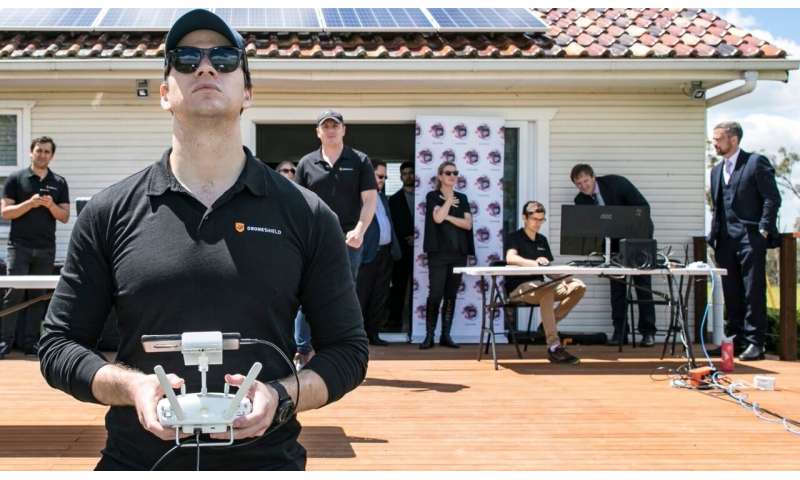
Now the University of Technology Sydney (UTS) and Sydney ASX-listed defense tech company DroneShield have produced next-generation drone technology to better identify threats from these aggressive UAS.

In a partnership funded by the NSW and Australian Governments, UTS and DroneShield—an Australian developer of counter-UAS solutions—have produced an optical system for detection, identification and tracking of fast-moving threats such as nefarious UAS, comprised of a camera and Convolutional Neural Network (CNN).

UTS and DroneShield began working together in October 2019—just a month after one of the most recent examples of aggressive use of drones when the oil facilities at Abqaiq–Khurais in Saudi Arabia were attacked by a swarm of UAS.

The new technology was recently demonstrated at Sydney Science Park.

The NSW Minister for Jobs and Western Sydney, Stuart Ayres, said the State Government was committed to helping small businesses grow through programs such as the NSW Government-funded Defense Innovation Network (DIN).

"The collaboration between DroneShield and UTS is exactly the type of industry/university partnership the NSW Government is committed to expanding," he said. "This is a key part of how the Government is supporting growth in jobs in NSW in areas such as defense tech. And seeing the technology here in Western Sydney, just outside of the future Aerotropolis, gives us a glimpse into the type of R&D and industry activity that will take place out here in the future."

UTS Vice-Chancellor Attila Brungs said this project is a great example of the types of partnerships UTS is committed to.

"For UTS to do what we do best—develop and translate world-leading research for practical application by industry—government support is critical. Having both the NSW and Australian Governments invest in this partnership, which has produced defense technology that can be used around the world, shows what can happen when universities, government and industry work together. UTS is committed to developing more industry co-working spaces, both on our home campus in the Sydney CBD, and here in Western Sydney at the Sydney Science Park with Celestino," Professor Brungs said.

Project lead and Co-Director of UTS Intelligent Drone Lab (IDL) Dr. Nabin Sharma said UTS has both expertise and experience in collaborating with industry partners to develop and deliver innovative vision systems for UAVs. This is seen in the multi-award-winning SpotterAI suite of drones (SharkSpotter, CrocSpotter) which identify particular threats to humans and are used to safeguard swimmers, fishers and other marine species.

"We are using CNNs and deep learning to provide a solution for DroneShield to identify drones which could be of potential threat," Dr. Sharma said. "The algorithm enables the vision system to see what's happening, to collate data and process it for ultra-fast image recognition and analysis. This delivers a speedy and efficient assessment of a threat and the decision-making in response to it. The system is able to detect different types of drones and check if there is a payload," he said.

Oleg Vornik, DroneShield's CEO, said "We are pleased to add this ground-breaking technology to our systems, enabling our customers a unique camera-based detection, ID and tracking of improvised threats such as UAS. This project has been a great example of collaboration between an Australian defense SME and an educational institution, promoting development of world leading, cutting-edge defense technologies right here in Sydney."


Explore further CrocSpotter app uses AI for detection
Apple expands renewable energy footprint in Europe

World’s largest onshore wind turbines in Denmark and new clean energy efforts in Germany advance Apple’s new 2030 carbon neutral goal

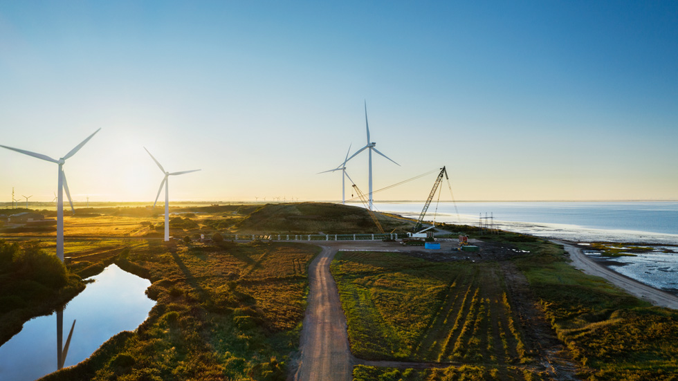
Apple is investing in the construction of two of the world’s largest onshore wind turbines near the Danish town of Esbjerg.

 Apple announced it will invest in the construction of two of the world’s largest onshore wind turbines, a source of clean, renewable energy that will bring its supply chain and products one step closer to carbon neutrality. Located near the Danish town of Esbjerg, the 200-meter-tall turbines are expected to produce 62 gigawatt hours each year — enough to power almost 20,000 homes — and will act as a test site for powerful offshore wind turbines. The power produced at Esbjerg will support Apple’s data center in Viborg, with all surplus energy going into the Danish grid.

“Combatting climate change demands urgent action and global partnership — and the Viborg data center is powerful proof that we can rise to this generational challenge,” said Lisa Jackson, Apple’s vice president of Environment, Policy and Social Initiatives. “Investments in clean energy deliver breakthrough innovations that bring clean energy and good jobs to businesses and local communities. This is an area where we have to lead — for the sake of our planet and future generations.”

Last month, Apple announced its plans to become carbon neutral across its entire business, manufacturing supply chain, and product life cycle by 2030. While Apple’s operations are already powered by 100 percent renewable energy and carbon neutral, this new commitment will mean that by 2030, every Apple device sold will have net zero climate impact. This includes transitioning all of its European-based suppliers to renewable power.


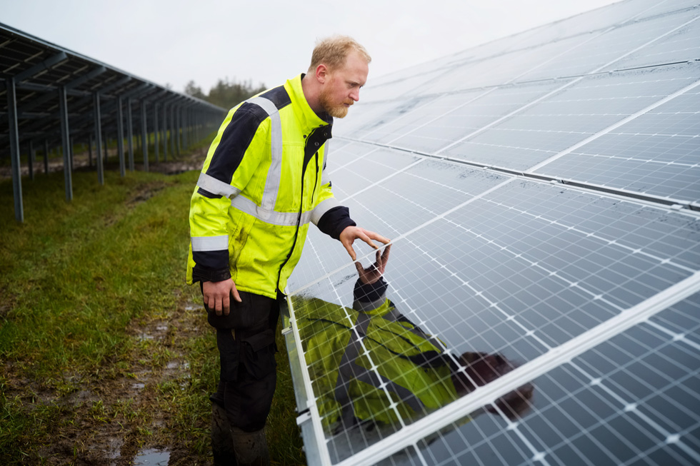
One of Scandinavia’s largest solar arrays was completed earlier this summer to power Apple’s Viborg data center, and is the first Danish solar project built without the use of public subsidies.

Supplier Clean Energy Progress

Germany-based supplier Varta committed this week to running its Apple production with 100 percent renewable power. Across Europe, Apple’s suppliers are working toward clean energy solutions for their Apple productions — including Henkel and tesa SE, also based in Germany, DSM Engineering Materials based in the Netherlands, STMicroelectronics based in Switzerland, and Solvay based in Belgium. These solutions include DSM’s wind power purchase agreement in the Netherlands and STMicroelectronics’s solar carport in Morocco. Companies like Solvay are now expanding their use of renewable energy to their broader operations after joining Apple’s Supplier Clean Energy Program five years ago.

Apple launched the program in October 2015 to help suppliers reduce their energy use and transition to 100 percent renewable electricity. Since its launch, 72 manufacturing partners in 17 different countries have committed to 100 percent renewable energy for Apple production. Once all of Apple’s supplier projects are completed, these commitments will avoid over 14.3 million metric tons of CO2e annually — the equivalent of taking more than 3 million cars off the road each year.

Viborg Data Center

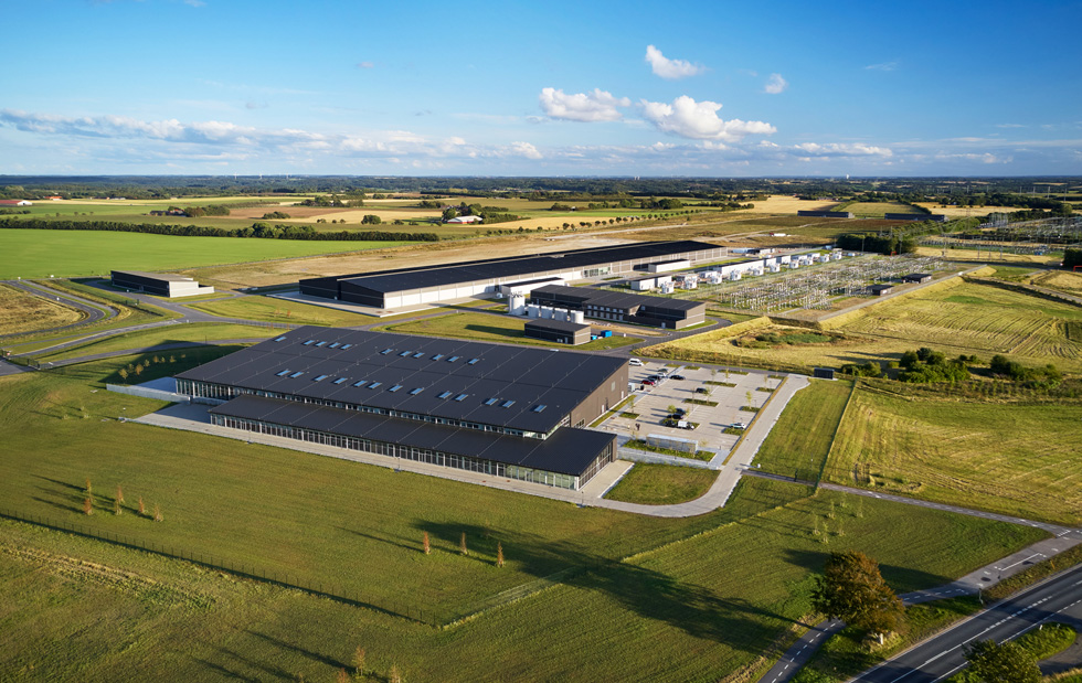
Apple’s data center in Viborg, a 45,000-square-meter facility offering network support and data storage to its users across the region, is now operational. The data center helps power Apple’s App Store, Apple Music, iMessage, Siri, and other services in Europe that are run entirely on renewable energy from local projects.


Like all of Apple’s data centers, the company’s Viborg data center is running on 100 percent renewable energy.

The Esbjerg wind project follows the recent completion of one of Scandinavia’s largest solar arrays, located in Thisted, Northern Jutland, the first Danish solar project built without the use of public subsidies. The wind and solar projects both support Apple’s newly completed data center in Viborg, which is powered by 100 percent renewable energy. Apple is developing both projects in partnership with European Energy.

The Viborg data center had over 600 specialist workers on site each day during construction and included many Danish businesses supporting its development. It is now run by a team of data specialists, technicians, maintenance, and security staff, many of whom were recruited from the local area.


The data center in Viborg features advanced green building designs, with a unique cooling system based on natural air flows that significantly decrease water and energy consumption.

Why is the Australian government trying to make the cashless debit card permanent? Research shows it does not work

by Elise Klein, The Conversation
The card is supposed to quarantine welfare payment for essentials such as food and groceries. Credit: www.shutterstock.com

Dystopic policy in Australia is often hidden in plain sight.

As Curtin University Professor Suvendrini Perera has written, systematic failures are not necessarily "spectacular acts" but the "decisions and indecisions of bureaucratic oversights and misplaced assumptions." And these amount to a "slow violence" over time.

One such failure is the Cashless Debit Card, which has been trialed in Australia since 2016.

Yet, among all the measures in last month's budget was the news the Morrison government will make the trial scheme "ongoing".

What is the Cashless Debit Card?

The Cashless Debit Card scheme quarantines 80% of social security payments to a cashless card, which prevents spending on alcohol, illegal drugs and gambling products.

It is currently being trialed in Ceduna in South Australia, the East Kimberley in Western Australia, the Goldfields in WA and Hervey Bay region in Queensland, with about 12,000 people involved.

The card compulsorily includes a broad range of people receiving support for many reasons, including payments for disability, parenting, caring, unemployment and youth allowance. The Australian Human Rights Commission is among those who have pointed out the the card disproportionately impacts First Nations people.

Research shows it does not work

Peer-reviewed research has consistently shown the card, and income management more broadly, do not meet policy objectives. A 2020 academic study of multiple locations found compulsory income management "can do as much harm as good."


Survey respondents reported not having enough cash for essential items, while the research found the card "can also stigmatize and infantilise users."

My research examining the card in the East Kimberley shows it makes life more difficult for people subjected to it, including making it harder to manage money. People also reported the card made it more difficult to buy basic goods such as medicine and groceries.

Other research from the Life Course Center suggests compulsory income management has been linked to a reduction of birth weight and school attendance. The majority of these children are First Nations kids.

Bill before parliament

A bill to make the card permanent was introduced to parliament just a day after the budget was handed down.

If passed, it will also transfer about 25,000 people in the Northern Territory and Cape York who are on the Basics Card (an earlier version of income management) onto the Cashless Debit Card.

Introducing the bill to the House, Morrison government minister Trevor Evans said the card was delivering "significant benefits" in the trial communities. "The program has the objective of reducing immediate hardship and deprivation, helping welfare recipients with their budgeting strategies and reducing the likelihood that they will remain on welfare and out of the workforce for extended periods."

The government also says the card is used "just like an everyday bank card" and is seeing a reduction in drug and alcohol use and gambling.

Senate inquiry

But as highlighted above, the value of the scheme is heavily disputed by policy experts. People put on the card, community groups, lawyers and doctors also oppose any expansion of the card.

The card's expansion has been the subject of a brief Senate inquiry, which is due to report on November 17.

This is the sixth Senate inquiry into the Cashless Debit Card. Each one has seen submissions from across the community which overwhelmingly reject the card.

First Nations groups have led the charge, stating income management is not in the spirit of self-determination and the current bill would "directly contradict the recent National Agreement on Closing the Gap."

Smoke and mirrors

Trials of public policy programs require, by definition, research to examine their performance and to justify any continuation. Yet, the government continues to rely on anecdotes and the widely criticized 2017 evaluation by ORIMA Research as "proof" for the roll out of the Cashless Debit Card.

In 2018, the Australian National Audit Office found the ORIMA evaluation was methodologically flawed and unable to provide any credible conclusions regarding the real impact of the trial.

In the latest bill, the government also misrepresents the findings from a 2014 evaluation of compulsory income management into the Northern Territory, claiming the findings were supportive of income management. Yet this evaluation "[did] not find any consistent evidence of income management having a significant systematic positive impact."

Compelled by the Senate, the government has since commissioned the University of Adelaide to evaluate the scheme. This research was due to be released by the end of 2019 but is yet to be made public.

When asked about the report in Senate estimates last month, Social Services Minister Anne Ruston said it was not about deciding whether the card would continue, but to give advice on "what what was working particularly well."

Perversely, the current bill also removes any need to further evaluate the Cashless Debit Card, instead opting to rely on the department to undertake its own desk-based research.

Why is evidence being ignored?

The protracted life of the Cashless Debit Card in Australian public policy shows the ongoing disregard for evidence-based policy making.

It also shows the continued slow violence against thousands of Australians who deserve much better from elected officials and the structures set up to support them.

Whilst it is easy not to pay attention to the mundane details of policy, the Cashless Debit Card shows we must.


Explore further
Provided by The Conversation

This article is republished from The Conversation under a Creative Commons license. Read the original article.
The way we use data is a life or death matter – from the refugee crisis to COVID-19

by Doug Specht and Monika Halkort, The Conversation
One of Nightingale’s diagrams – in this case demonstrating the causes of mortality in the army in the East, published in 1858. Credit: Wikimedia Commons

In moments of crisis we often turn to data in an attempt to both understand the situation we are in, and to look for answers of how to escape.

In response to COVID-19, governments around the world have employed algorithms, used data from apps installed on our phones, alongside CCTV, facial recognition and other data gathering tools to fight the pandemic. Data is being used to drive the daily movements of billions of people in a way that many of us have never before seen. People are being instructed to stay home, go to work, wear masks, or send their children to school based on the invisible hand of data.

Yet 2020 has also highlighted the dangers of this. The interpretations and collection of this data are not without their problems—doctors and politicians looking at the same data can draw wildly different conclusions about the right course of action.

Without doubt, we should be harnessing all the tools we can in the fight to save lives, but the pandemic has also brought many issues with data mapping to the fore. COVID-19 disproportionately affects the poorest people in many countries, as well as black and Asian communities. This is is no small part due to data-driven regulations designed to stop the spread of the disease; often modelled on assumptions made by the people who design and run them.

These inequalities already existed, but models that slow a spread through the closing of offices, reduced transport and home schooling put enormous pressures on the poorest and most vulnerable members of society, who are not privileged enough to change their working or living arrangements. As digital technologies are further introduced, such as mobile track and trace, these communities will be marginalised even further. Even in the richest countries, those without a smartphone will be missed from any digital tracing apps designed to protect people.

While these practices are newly confronting to many, such technologies—and their failings—have long been used to shape the lives, and deaths, of millions around the world. In the digital age, mapping and data continue to be seen as a fix-all. More people than ever are subjected to having their lives dictated not by elected officials, but by black box algorithms, maps, and data visualisations. As our attempts to hold the pandemic at bay continue, we must look at lessons from other crises and push for a more just world.


To do this, it is crucial that people understand the slippery quality of data. Statistics seem solid to many people. But data can mislead, and understanding how this happens is a huge step in the right direction of using data to improve the lives of millions of people around the world, and to tackling global crises such as COVID-19.

There are three main issues with data.

1. Dark data

The first issue seems on the surface the easiest to fix. Dark data refers to data that is not collected at all. Many people believe that if we collected enough data about everything then we could solve any issue. Yet it is impossible to collect everything: there will always be dark data.

We don't, for example, collect data about or from children in the same way as adults because of laws around consent. Data is often collected through tools that are not available to everyone—mobile phones share huge amounts of information, but not everybody has a phone.

The real trouble comes due to what are known as epistemic and ideological assumptions. These assumptions mean that even with the best intentions, we cannot gather data about things that we assume we do not need, or that we do not know that we need data about. Stark examples include how frequently women are excluded from trials and testing, either forgotten about, or based upon assumptions they are the same as men. This can have deadly consequences.

At times our biases also push us towards not collecting data that we sense goes against our own interests or views of the world. A surprisingly powerful urge to retain our status quo paralyses us from breaking through this barrier.

2. Data positivism

The issues of dark data are closely linked to another issue, known as data positivism. This relates to what we do with the data we have captured.

It is all but impossible to present all the data we find. This might be because we have too much of it, or because we are trying to tell a specific story with our data. As we turn the data in to maps and visualisations, we must make choices about what is and isn't included, which often takes the form of prioritising one type of knowledge over another.

Data that fits well with traditional mapping practices will be more likely to be included on a map than other forms of information. This can turn extremely complex and competing sets of ideas into overly simple sets of data, which in turn is transformed into an even further simplified data visualisation. These visualisations are rarely questioned, because the way they are made is beyond the expertise of most people. The expertise of the creator is trusted wholesale—they create a false sense of certainty, but one we hold on to, especially if they reinforce our status quo.

3. Data washing

Then there's the issue of data washing. Let's assume that you have avoided the problems of dark data and collected everything, including the data you didn't know you needed, and that you have navigated data positivism in the cleaning and preparing of your data.

You then come to present your findings. Perhaps they don't really show the story you wanted, or show the opposite of what you thought—what do you do? Do you tweak things so they look different? Do you skip that diagram and move to another that shows something closer to your hypothesis? Do you choose not to share anything at all?

These seem like easy questions to answer, easy to stay on the correct side of ethical practice. But even with the best of intentions we can dismiss our own data when it doesn't conform to pre-held assumptions. We might tell ourselves we must have made a mistake in data collection, so shouldn't share it. Or we might think: that doesn't tell a good story, I'll leave it out. Or perhaps: this should be more dramatic, I'll change the colours and design to make it pop.

These are not always disingenuous, but these seemingly innocent decisions conceal or obscure data and knowledge. They are hard to avoid even with the best of intentions, and when it comes to issues of controversy, the best of intentions is often left wanting.

In turning people into pure data, life and death decisions are made about people without their consent. These are the dehumanising effects of an algorithm-driven world.

Lessons from history

Mapping and data visualisation have long been used in times of crisis to help us make sense of what is happening, and to find ways forwards that might preserve lives and create a better future. Prominent examples include Thomas Shapter's 1832 maps of cholera in Exeter, UK, followed by the more famous maps of cholera deaths produced by John Snow in London. These maps and their authors were credited with bringing new understanding of waterborne disease and saving many lives.

Florence Nightingale, whose name was given over to the emergency hospitals constructed around the UK in the wake of COVID-19, was also a statistician.

In 1861, as part of her consultation to the US army about care for Civil War casualties, Nightingale made data visualisations, and a lot of them. She created bar charts, stacked bars, honeycomb density plots, and 100% area plots.

Nightingale's data visualisations were not about just showing what was happening, they were designed to call for change; to indicate required reform. She also invented a new type of chart to help her arguments: a comparative polar-area diagram known today as the Nightingale rose (she called them "wedges"). Her most famous diagrams showed the changes in survival rates of patients following sanitary improvements, such as washing hands regularly, and emphasised the effectiveness of these improvements by difference in size.
Shapter’s 1832 maps of cholera. Credit: Wikimedia Commons

Nightingale, Shapter, Snow, and many others have used charts and diagrams to build graphic arguments and easy-to-understand comparisons that saved many lives. But when looking back at them, we often only consider the final product (map or chart), rather than the process of their creation. Yet at the time, these works were widely dismissed, and often misinterpreted as supporting the prevailing thoughts of the period.

There were many who did not want to enact the reforms proposed by Nightingale, although they are now seen as transformative in how hospitals are run. And Snow's maps became more famous than Shapter's not only because they were of London, but because of the evocative story of him striding onto Broad Street and tearing off the handle of the community water pump. What's forgotten is that this act was required precisely because his data and mappings were initially misinterpreted by those who chose to see Snow's maps as supporting their own theories—an example of confirmation bias where we read data in a way that suits our own views.

Both Snow and Nightingale saved countless lives through their data work, but even they came up against many of the issues of dark data, data positivism and misinterpretation.

In the digital age, where data is collected on a massive scale, often without consent, and is increasingly organised, sorted and interpreted by computers and algorithms, data has become seen as both a fix all for everything, and a dangerous commodity. The use of data to track people and dictate their actions can mean the difference between life and death in a very real and present sense. While that has been made clear to many of us in relation to COVID-19, there are many more stories of data, crisis and the fight for survival.

In our new book, Mapping Crisis, we look at the experiences of those who have been mapped or had their complex lives reduced to data, aerial photos or reports. From this we are able to draw out better ways of working, and better understandings of the various effects the secret world of data has on our everyday lives.

One of our examples is the case of the Mediterranean migrant crisis.

Life, death and data

The Mediterranean Sea is a place that for many conjures images of sun-kissed beaches, fine waterfront dining and turquoise seas. But this stretch of water is also one of the most heavily policed in the world. All movements in the region, whether deemed legal or not, are extensively mapped and monitored by the European Union.

While individual countries on the Mediterranean have long fortified their borders, the formation of the EU effectively created a single border along the northern shores. Since then, European states have continued to put in place an ever more comprehensive, and complex, system for monitoring and exchanging information about irregular migrants trying to reach the continent.

Running under the label EUROSUR, the system combines high-resolution satellite images, long-endurance drones, automated vessel identification systems and seaborne military radars that allow for situational reports and risk analyses in next to real time. These reports give daily updates on "successfully" intercepted migrant vessels.

But this highly sophisticated tool of mapping the movements of migrants is only interested in those who are stopped. The extensive databases held by EU states hold next to no information about those who die or go missing as they attempt to seek refuge. Those who make it onto European shores, by contrast, are rigorously screened for biometric data, including electronic fingerprints, iris scans and medical checks, and also for personal details about their lives to verify their identity.

According to the International Organisation for Migration (IOM), more than 19,000 people have drowned or gone missing on their way to Europe over the last decade. These figures are only estimates: there is no comprehensive system in place to document migrant fatalities across EU member states. European governments do not consider migrant deaths part of their legal responsibility and so do not keep a regular track record of them. This leaves humanitarian agencies like IOM dependent on eyewitness accounts and reports from search and rescue NGOs, medical examiners or the media.

The lack of knowledge regarding migrant deaths reveals how patchy real time tracking of movement across borders really is. It also serves political agendas, where data on the "risk" to Europe from migration can easily be found, but data on the true life and death risks of crossing the Mediterranean is occluded from public knowledge. This makes it easier to present migrants as a threat, rather than as refugees putting everything on the line to seek safety.

And for Frontex, the European Border and Coast Guard Agency, this provides a convenient backdrop to legitimise the increasing militarisation of Europe's borders under the pretext of preventing further deaths and human suffering.

Along the border, digital maps and statistical charts operate to reinforce the political and social aims of the organisations and governments that collate them. Data is selectively collected, and selectively presented by the EU and European governments, extending Europe's migration policy of deterrence and containment deep into the digital domain.

In the specific context of the Mediterranean, this selective reading of data not only minimises the chances of successful asylum applications for those lingering in the reception centres of Greece and Turkey, it also allows governments and the EU as a whole to evade any legal and political responsibility for the human cost of border policing. By not collecting data on those who drown, the EU can hide the fact that for all its sophisticated mapping and tracking technologies, they have no interest in using the data to save lives, or for rescuing men, women and children lost at sea.

No records of deaths means no records of how many European governments watched drown.

Radical data mapping

That said, Europe's wilful "unseeing" of migrants has not gone uncontested. Numerous civil society initiatives and humanitarian activists have made it a point to keep a regular track record of those who die or go missing and to hold Europe to account.

Initiatives such as the List of Deaths, compiled by organisations such as UNITED and FORTRESS Europe, meticulously document each and every reported incident, using these figures for advocating a radical revision of European asylum policy. While these counter-mappings certainly manage to disrupt the wall of silence surrounding the human cost of border policing, the death lists have done little to disrupt or redirect the priorities of the state.

The transnational network Alarm Phone marks a rare exception in this regard. Alarm Phone offers a 24/7 hotline for migrants in distress. The organisation secures their rescue by notifying national coastguards and port authorities of unfolding emergencies at sea. Using a combination of mobile phones and online messaging apps such as Facebook, Viber, WhatsApp and Skype, alongside logistical platforms such as AIS (The global Automatic identification system used for vessel tracking) and call management software, they attempt to preempt deaths, and prompt action to rescue people at risk of drowning.

The organisation has aided thousands of people in distress. The summer of 2020 was an especially difficult one. With Europe's borders closed tighter than ever, Alarm Phone was inundated with calls. In the seven days following August 13, nearly 900 people on 14 boats called Alarm Phone with pleas for help. Alarm Phone raised the alert, and while some were helped to safety, either in Europe or Libya, more than 260 people perished or remain missing.

By bring together technology, networking capacities, and through solidarity and compassion the volunteer network is able to both aid migrants in times of trouble, and to help them pass more effectively under the radar of the EU. The hotline is more than just a distress call: it brings together the knowledge of migrants into effective "maps" that aid in the logistics of crossing the med. In doing so it also highlights the wilful misuse, and sporadic data collections of the EU member states.

A warning

A lot can be learned from the data mapping of the migrant crisis. Maps and data can only ever be partial representations of reality, but as we gather more and more data we can be lured into thinking that these representations are infallible.

Yet, it is clear from the example above that the processes in place do not preserve life: they are tools of control rather than support. There are glimmers of hope in the counter-mapping projects that have arisen to give voice to those who are condemned to silence as they seek a new life. But even the most well-intentioned projects can fall foul of misunderstanding data. Data tends to have a life of its own.

COVID-19 has brought the world of data-driven crisis management to the doorstep of the whole world, but these are not new experiences. Many people have already been reduced to data points. From the Mediterranean to school grades, lives are increasingly dictated by algorithm, computation, and the biases built into these technologies. The way in which we use data is heavily influenced by politics, a desire to maintain the status quo and by conscious and unconscious decisions made at every stage of the process.

So we should question data: how it is collected, and how it is deployed. But data is also important, and we must not dismiss it all outright. The world has seen a push-back against science and a growth in "alternative facts". The rise in anti-maskers, anti-vaxxers, 5G conspiracy theorists and coronavirus deniers has shown how dangerous this can be. Such arguments push backwards, not forwards. They do not seek to understand more, but are maintaining a status quo.

While some might try and twist the arguments we've presented here in order to reject science, we are instead saying that we should ask questions that take our understanding further. It is near impossible to eliminate issues caused by dark data, data washing, and data positivism. This can be purposefully, or accidental, but the effects can be far reaching.

So, next time you look at a map and or data visualisation, ask: who is this for? Whose power does it enhance or consolidate? Who is missing from the data? Who was never asked, forgotten or excluded? Who loses? And how can we do it better?


Explore further Migrant deaths are 'vastly under-reported' according to new report

Provided by The Conversation


10 reasons to stop whipping racehorses, including new research revealing the likely pain it causes

by Paul McGreevy, Bidda Jones, The Conversation
Microscopic cross-sections (400x magnification) of horse (left) and human skin. Images show the epidermis (top) and superficial dermis. Selected nerve endings are shown in red and marked with asterisks. Scale bars represent 20 micrometres. Credit: Tong et al. 2020, Author provided

Pressure is increasing on the global horse-racing industry to reconsider the use of whips in the sport.

Our research, published in the journal Animals, shows horses' skin is very similar to humans' in both thickness and the arrangement of nerve endings.

This adds to existing evidence that whipping is ineffective and unethical. Here we outline ten reasons why it's time to drop the crop.

1. Horses' skin appears just as sensitive as humans'

At the core of the debate is the question of whether horses experience pain when being whipped. A Sydney-based research team (of which one of us, Paul McGreevy, was a member) examined skin from 10 human cadavers and 20 euthanased horses under a microscope to explore any differences in their skin structure and nerve supply.

The results revealed no significant difference between humans and horses in the concentration of nerve endings in the outer, surface layer of skin.

2. Horses' skin is no thicker than humans'

The new study also found no significant difference between humans and horses in the average thickness of this outer layer.

Horses need skin that is both robust and sensitive to touch, particularly from other horses or flying insects. The inner, base layer of skin in humans is significantly thinner than in horses, but this is not where the nerve endings lie.

3. Whip-free racing already exists

Norway outlawed the whipping of racehorses in 1982. In the United Kingdom, "hands and heels" races for apprentice jockeys have been part of the racing calendar since 1999. These events, in which the least experienced (and presumably most vulnerable) jockeys race without using the whip, is at complete odds with the industry's contention that whips are essential for steering and safety. There are no reports from Norway or the UK of problems in the conduct of these races.
Credit: The Conversation

4. There's no evidence whips make racing safer…

Whip use has been claimed to be essential for the safety of horses and jockeys. However, the impact of whip use on steering and safety had not been examined until a recent study compared "whipping-free" races, in which whips are held but not used, with "whipping-permitted" races.


Races of these two types were meticulously matched for racecourse, distance, number of runners, and "going" (turf conditions on the day). A detailed examination of stewards' post-race reports revealed no difference between the two race types in movement of horses across the track and interference with other runners, and therefore no evidence whipping improves safety. This adds to evidence from jumps racing that whip use is associated with catastrophic falls.

5. …or fairer…

The gambling industry has an interest in ensuring races are run with integrity, lest punters take their dollars elsewhere. Whip use is arguably the most visible sign that jockeys are indeed trying their hardest.

But the same study of stewards' reports revealed no difference between "whipping-free" and conventional races in terms of the number of incidents related to jockey behavior, such as careless riding or jockeys "dropping their hands" (indicative of not pushing the horse to run on).

The key to a fair race is not encouraging jockeys to use the whip, but rather ensuring all jockeys are subject to the same rules.

6. … or faster

The received wisdom is that whipping any horse makes it more likely to win. However, studies have shown increased whip use does not significantly affect speed at the finishing line, and the comparison study cited above found no difference in finishing times between whipping-free and conventional races.

What's more, in "hands and heels" races, the jockey's center of mass is likely to remain directly above the horse's center of mass for more of the time, compared with when the jockeys are whipping the horses. So, the biomechanics of whip-free racing are arguably better for equine performance.


Demonstration of the effect of a whip strike on human skin.


7. Whip rules are hard to police

The most prevalent breaches of the rules around whip use involve forehand strikes on more than five occasions before the 100-meter mark (44%), and the jockey's arm being raised above shoulder height (24%). Studies of high-speed footage of 15 races revealed at least 28 rule breaches, involving nine horses, that were not recorded in stewards' reports.

There are two reasons for this: the footage seen by racing stewards is filmed head-on, and is recorded at fewer frames per second than high-resolution video now provides. Head-on footage is preferred by stewards as it allows estimations of whip use on both sides of the horse, but it makes it harder to accurately police other aspects of whip use, such as the use of excessive force.

A separate study revealed more breaches are recorded at metropolitan than country or provincial racecourses, and by riders of horses that finished first, second, or third rather than in other positions. That said, horses that finished last were also worryingly vulnerable to whip-rule breaches.

What's more, even legal whipping is likely to cause significant pain, given the similarity of human and horse skin.

8. The public supports a ban on whipping

In a recent independent poll of more than 1,500 Australian adults, 75% thought horses should not be hit with a whip in the normal course of a race. The survey also found men were more than twice as likely as women to support whipping racehorses. Even among respondents who attended races or gambled on them at least once a week, 30% disagreed with whipping.


9. Whip-free racing still allows betting

While the ethics of promoting gambling is a different debate entirely, whip-free races in Norway and the UK still allow people to bet. It may even be more attractive to sponsors seeking assurance their brand is only associated with ethical activities.

10. Whipping tired animals in the name of sport is hard to justify

Horses have evolved to run away from painful pressure on their hindquarters, given the most likely natural cause of such stimulation is contact from a predator. Repeatedly whipping tired horses in the closing stages of a race is likely to be distressing and cause suffering. The horse's loss of agency as it undergoes repeated treatment of this sort is thought to lead to the state of "learned helplessness," in which animals learn they can do nothing to end their distress.

Racing must reckon with two key questions: does whipping actually work as intended, and is it an ethical way to treat a horse in the name of sport?

If the answer to both of those is "no," a third question arises: why are jockeys still doing it?


Explore further

Provided by The Conversation

This article is republished from The Conversation under a Creative Commons license. Read the original article.
Fashion industry's hidden environmental timebomb revealed

by Northumbria University
Credit: CC0 Public Domain

The devastating environmental impact of plastic clothing hangers has been revealed for the first time—with calls for the fashion industry to urgently address the issue.


Research by ethical fashion expert Dr. Alana James, of Northumbria University, has found that more than 954 million plastic garment hangers are used every year in the UK fashion industry.

Of these, 16% are used solely for transporting clothing from manufacturers to shops and are then discarded, drawing parallels with single-use items such as plastic bottles, carrier bags and drinking straws.

However, while the environmental impact of these products has been recognized and addressed through cost implications, sustainable alternatives and government policy
, little has been known about the impact of plastic hangers until now.


Working with Fashion Consultant Emma Reed, Dr. James anonymously surveyed a wide variety of UK fashion businesses, from luxury bands to high street retailers, including e-commerce operations.

Commenting on the findings of their report Hanger usage in the UK, Dr. James said: "For nearly a century now fashion has had an unhealthy reliance on the use of plastic, with 65% of all garments currently produced being made from synthetic fibers. However, hangers remain a largely overlooked area of environmental impact in the industry, despite 60% of all clothing sold being associated with a plastic hanger."

The research, which was carried out in partnership with sustainable hanger brand Arch & Hook, also revealed that 60% of all clothes sold in the UK came with an associated plastic hanger, and that more than 82 million hangers are sent out with online clothing orders in the UK each year.

Dr. James, a Senior Lecturer in Fashion at Northumbria University, said: "More than two thirds of the fashion companies we interviewed were unaware what type of plastic or plastics their hangers were made from, making it difficult or impossible to recycle them. While there has been a definite shift in awareness of the environmental impact of the fashion industry in recent years, the issue of plastic hangers seems to be one which has been largely ignored until now. Manufacturers, retailers and consumers all have a role to play in instigating change and we hope the results of this research will raise awareness of this problem and lead to alternative solutions."

Sjoerd Fauser is founder and CEO of Arch & Hook, which combines recycled and recyclable materials to create durable hangers, as well as coordinating hanger recollection operations.

He explains: "Our eye-opening report is just the tip of the iceberg. Data for worldwide hanger usage remains unavailable. We are determined to expand the research into other areas, in collaboration with more partners, to unveil the truth, create awareness and turn sustainability into a tangible action."

The 32-page report, "Hanger usage in the UK," researched the number of plastic hangers used throughout 2019 in the UK clothing market.


Explore furtherQ&A: Sustainability manager on the benefits of a plastic bag ban
More information: Hanger usage in the UK. northumbria-cdn.azureedge.net/ … hanger-usage-uk_arch—hook.pdf?modified=20201112075850
Provided by Northumbria University
Smart concrete could pave the way for high-tech, cost-effective roads

by Luna Lu and Vishal Saravade, The Conversation
The Golden Gate Bridge in San Francisco averages more than 100,000 vehicles daily. 
Credit: Saketh Garuda for Unsplash

Every day, Americans travel on roads, bridges and highways without considering the safety or reliability of these structures. Yet much of the transportation infrastructure in the U.S. is outdated, deteriorating and badly in need of repair.

Of the 614,387 bridges in the U.S., for example, 39% are older than their designed lifetimes, while nearly 10% are structurally deficient, meaning they could begin to break down faster or, worse, be vulnerable to catastrophic failure.

The cost to repair and improve nationwide transportation infrastructure ranges from nearly US$190 billion to almost $1 trillion. Repairing U.S. infrastructure costs individual households, on average, about $3,400 every year. Traffic congestion alone is estimated to cost the average driver $1,400 in fuel and time spent commuting, a nationwide tally of more than $160 billion per year.

I am a professor in the Lyles School of Civil Engineering and the director of the Center for Intelligent Infrastructures at Purdue University. My co-author, Vishal Saravade, is part of my team at the Sustainable Materials and Renewable Technology (SMART) Lab. The SMART Lab researches and develops new technologies to make American infrastructure "intelligent," safer and more cost-effective. These new systems self-monitor the condition of roads and bridges quickly and accurately and can, sometimes, even repair themselves.
The Purdue engineering lab has installed smart technology in three Indiana interstate highways.


Smart, self-healing concrete


Infrastructure—bridges, highways, pavement—deteriorates over time with continuous use. The life of structures could be extended, however, if damages were monitored in real time and fixed early on. In the northern U.S., for example, freeze-thaw cycles in winter cause water to seep into the pavement where it freezes, expands and enlarges cracks, which can cause significant damage. If left unrepaired, this damage may propagate and break down pavements and bridges.

Such damage can be identified and repaired autonomously. At an early stage of a crack, for example, self-healing pavement would activate super absorbent polymers to absorb water and produce concrete-like material that fills in the crack. Cracks as small as a few microns could be healed to prevent significant damage by preventing or delaying the later stages of the freeze-thaw cycle.


The astonishing properties of absorbent polymers.

Roadway technology

Many researchers in the world are working on improving construction infrastructure. Technologies recently being explored include solar and energy-harvesting roads, charging lanes for electric vehicles, smart streetlights and reducing carbon-related emissions from construction materials.

At the Purdue SMART Lab, our team is also testing novel sensors that monitor transportation infrastructure by embedding them in several Indiana interstate highways. We plan to expand to other state highway systems in the next few years with a goal to better accommodate increased traffic and provide accurate estimates of road conditions during construction and its life.

Sensors embedded in concrete pavement acquire information about the infrastructure's health condition in real time and communicate the data to computers. Electrical signals are applied through the sensors. Concrete's vibrations are converted into electrical signals that are read and analyzed by lab-built customized software. This enables transportation engineers to make effective and data-driven decisions from opening roads to traffic and to proactively identifying issues that cause damage or deterioration.


Sensors embedded in concrete can signal the health of roadways.
 Credit: Erin Easterling/Purdue University.

After concrete is poured for highway pavement, for example, it takes hours to cure and become strong enough to open for traffic. The timing of when to open a highway depends on when the concrete mix is cured. If a roadway opens too early and the concrete is undercured, it can reduce the life expectancy of the pavement and increase maintenance costs. Waiting too long to open a road can result in traffic delays, congestion and increased safety risks for construction workers and commuters. Curing concrete for massive highway projects requires close attention by engineers in conjunction with the weather specific to that region.

Smart sensors embedded in concrete enable engineers to monitor the infrastructure and make data-driven decisions about when a road can open while retaining maximum life expectancy. Sensors can also help monitor the quality of concrete and whether it is robust enough to withstand traffic flow and corrosion after a roadway is opened. Smart, efficient infrastructure can significantly reduce structural failures, both catastrophic and through normal wear, as well as lead to reduced costs and provide new ways for structural engineers to assess real-time information about the pavement.

Sensors installed on Indiana interstate I-74. Credit: Erin Easterling/Purdue University, CC BY-ND
Self-healing concrete test study with cracked concrete (left) and self-healed concrete after 28 days (right). Credit: SMART Lab/Purdue University, CC BY-ND
Saving time and money

Congress recognizes the need to invest in American transportation systems. A $494 billion legislation package, the INVEST In America Act, was recently introduced to address America's deteriorating highways and bridges while diminishing carbon pollution.

Smart sensors and intelligent infrastructure system can enable significant savings of time and money with improved construction safety. Sensors can provide engineers with real-time data of the quality of our infrastructure to make the best decisions for building and maintaining roads, bridges and pavements while improving safety for drivers and construction workers. The addition of self-repairing properties can help build sustainable and long-lasting infrastructure to reduce maintenance and costs.


Explore further Enabling highways and bridges to prevent their own damage
Provided by The Conversation

This article is republished from The Conversation under a Creative Commons license. Read the original article.

The Matrix is already here: Social media promised to connect us, but left us isolated, scared and tribal

by Arash Javanbakht, The Conversation
Credit: Unsplash/CC0 Public Domain

About a year ago I began to follow my interest in health and fitness on Instagram. Soon I began to see more and more fitness-related accounts, groups, posts and ads. I kept clicking and following, and eventually my Instagram became all about fit people, fitness and motivational material, and advertisements. Does this sound familiar?

While the algorithms and my brain kept me scrolling on the endless feeds, I was reminded of what digital marketers like to say: "Money is in the list." That is, the more customized your group, people and page follows, the less time and money is needed to sell you related ideas. Instead, brand ambassadors will do the work, spreading products, ideas and ideologies with passion and free of charge.

I'm a psychiatrist who studies anxiety and stress, and I often write about how our politics and culture are mired in fear and tribalism. My co-author is a digital marketing expert who brings expertise to the technological-psychological aspect of this discussion. With the nation on edge, we believe it's critical to look at how easily our society is being manipulated into tribalism in the age of social media. Even after the exhausting election cycle is over, the division persists, if not widening, and conspiracy theories continue to emerge, grow and divide on the social media. Based on our knowledge of stress, fear and social media, we offer you some ways to weather the next few days, and protect yourself against the current divisive environment.

The promise, the Matrix

Those of us old enough to know what life was like before social media may remember how exciting Facebook was at its inception. Imagine, the ability to connect with old friends we had not seen for decades! Then, Facebook was a virtual dynamic conversation. This brilliant idea, to connect to others with shared experiences and interests, was strengthened with the advent of Twitter, Instagram and apps.

Things did not remain that simple. These platforms have morphed into Frankenstein's monsters, filled with so-called friends we've never met, slanted news stories, celebrity gossip, self-aggrandizement and ads.

The artificial intelligence behind these platforms determines what you see based on your social media and web activity, including your engagement with pages and ads. For example, on Twitter you may follow the politicians you like. Twitter algorithms quickly respond and show you more posts and people related to that political leaning. The more you like, follow and share, the faster you find yourself moving in that political direction. There is, however, this nuance: Those algorithms tracking you are often triggered by your negative emotions, typically impulsivity or anger.

As a result, the algorithms amplify the negative and then spread it by sharing it among groups. This might play a role in the widespread anger among those engaged in politics, regardless of their side of the aisle.

The digital tribe

Eventually, the algorithms expose us mostly to the ideology of one "digital tribe"—the same way my Instagram world became only superfit and active people. This is how one's Matrix can become the extremes of conservatism, liberalism, different religions, climate change worriers or deniers or other ideologies. Members of each tribe keep consuming and feeding one another the same ideology while policing one another against opening up to "the others."

We are inherently tribal creatures anyway; but particularly when we're scared, we regress further into tribalism and tend to trust the information relayed to us by our tribe and not by others. Normally, that's an evolutionary advantage. Trust leads to group cohesion, and it helps us survive.

But now, that same tribalism—along with peer pressure, negative emotions and short tempers—often lead to ostracizing those who disagree with you. In one study, 61% of Americans reported having unfriended, unfollowed or blocked someone on social media because of their political views or posts.

Higher levels of social media use and exposure to sensationalized news about the pandemic is linked with increased depression and stress. And more time spent on social media correlates with higher anxiety, which can create a negative loop. One example: The Pew Research Center reports 90% of Republicans who get their political news only from conservative platforms said the U.S. has controlled the COVID-19 outbreak as much as possible. Yet less than half of Republicans who rely on at least one other major news provider thought so.

The Matrix does the thinking

Human thinking itself has been transformed. It's now more difficult for us to grasp the "big picture." A book is a long read these days, too much for some people. Scrolling and swiping culture has reduced our attention span (on average people spend 1.7 to 2.5 seconds on a Facebook news feed item). It has also deactivated our critical thinking skills. Even really big news doesn't last on our feed longer than a few hours; after all, the next blockbuster story is just ahead. The Matrix does the thinking; we consume the ideology and are bolstered by the likes from our tribemates.

Before all this, our social exposure was mostly to family, friends, relatives, neighbors, classmates, TV, movies, radio, newspapers, magazines and books. And that was enough. In that, there was diversity and a relatively healthy information diet with a wide variety of nutrients. We always knew people who were not like minded, but getting along with them was normal life, part of the deal. Now those different voices have become more distant—"the others" we love to hate on social media.

Is there a red pill?

We need to take back the control. Here are seven things we can do to unplug ourselves out of the Matrix:
Review and update your ad preferences on social media at least once per year.
Confuse the AI by flagging all ads and suggestions as "irrelevant."
Practice being more inclusive. Check other websites, read their news and do not "unfriend" people who think differently from you.
Turn off cable news and read instead. Or at least put a disciplined limit on hours of exposure.
Check out less biased sources of news such as NPR, BBC and The Conversation.
If you think everything your tribe leaders say is absolute truth, think again.
Go offline and go out (just wear your mask). Practice smartphone-free hours.
Finally, remember that your neighbor who supports the other football team or the other political party is not your enemy; you can still go for a bike ride together! I did today, and we didn't even have to talk politics.

It's time to take the red pill. Take these seven steps, and you won't give in to the Matrix.


Explore furtherIt's not if, but how, people use social media that impacts their well-being
Provided by The Conversation

This article is republished from The Conversation under a Creative Commons license. Read the original article.