Thursday, March 12, 2020

Visualizing the Wealthiest Billionaires Around the World in 2019

Becoming a billionaire is about as probable as being struck by lightning (i.e. NOT likely). If you live in North America your odds of becoming a billionaire are one in 785,166. Your odds of being hit by a lightning bolt are one in 750,000. If you defy the odds, you become a member of an elite club with less than 3000 members worldwide. While there are thousands of billionaires, each country has just 1 richest billionaire.
  • The average net worth of the 73 listed billionaires is $14.8 billion
  • Jeff Bezos, wealthiest billionaire in the world, has a net worth over 10x the average at $149.7 billion
  • Most common sources of wealth: Banking/Finance/Investments, Diversified (large conglomerates with multiple divisions) and real estate
  • 5 of the 73 listed are women
Our graphic takes data from the most recent Forbes billionaire list. The graphic shows the one richest person from the 73 countries listed. The image further groups the billionaires by their respective region (Americas, Asia, Europe, Africa), highlights the source of their wealth (i.e. Banking, Diversified, Mining etc) and their estimated net worth figure. Find out who your country’s richest person is below.

Top 5 Richest Billionaires By Wealth and Country

1. Jeff Bezos - $149.7B, U.S.
2. Bernard Arnault - $89.3B, France
3. Amancio Ortega- $63.7B, Spain
4. Carlos Slim Helu- $60B, Mexico
5. Mukesh Ambani - $52.9B India
The list of billionaires is impressive with many of them touting international celebrity status. Looking at the makeup of these individuals based on their geographic location also highlights some interesting takeaways. Here is a breakdown of what industries created the most wealth in each region:
  • Americas - Banking is the dominant player for wealth creation with over $306 billion of wealth created
  • Europe - Retail focused with many iconic brands (NutellaRedBullLVMHZARA etc) with $433.7 billion of wealth
  • Asia - Real estate is the wealth creator of choice with $271 billion of wealth
  • Africa - Commodities (Cement, Foodstuff, Diamonds etc) with $43 billion of wealth
While knowing how billionaires become rich is interesting, knowing how they spend their wealth is more insightful. Philanthropy of the world's wealthiest is big business. Some have been generous giving away nearly 1% to 2% of their net worth to date. The most generous are committing to giving half, if not all away.
The Giving Pledge founded by Bill and Melinda Gates, is an organization that seeks to convince the world's wealthiest people to give away half of their wealth to philanthropic endeavors. To date, 204 people have signed the pledge from 22 countries. Notable signers include Richard Branson, Warren Buffet, Bill Gates, Mark Zuckerberg and others. In terms of the wealthiest from each country, none are on the list with the notable exception of Mackenzie Bezos. Bezos, the ex-wife of Jeff Bezos, has a net worth of $36 billion and has committed to the Giving Pledge.
The Giving Pledge has notable billionaires but none that top the wealthiest list from their respective countries. The pledgers tend to be couples and from North America which has the greatest concentration of billionaires in the world. The U.S. has more billionaires than China, India and Germany combined. As the world’s billionaire population becomes more global, one would hope that philanthropy also follows suit.
About the article
Published: 13 June 2019

Mapping the Population of Global Millionaires in 2019

More millionaires live in the U.S. than any other country in the world, and it’s not even close. That’s according to the 2019 Global Wealth Databook by Credit Suisse. Here’s how the U.S. compares to the rest of the globe.
  • The U.S. has 18.6M millionaires, more than any other country in the world.
  • Europe has more millionaires than Asia, with the U.K. (2.5M) leading the continent followed closely by Germany (2.2M) and France (2.1M).
  • China (4.4M) is home to the most millionaires in Asia, followed by Japan (3.1M).
  • South America (673K) and Africa (171K) are almost entirely missing from our map because so few people are millionaires in those places.
The numbers behind our map come from the 2019 Global Wealth Databook by Credit Suisse. You can read about the researchers’ detailed methodology in the report itself. We created a map using one dot to represent 1,000 millionaires, color-coding each country by continent. Credit Suisse grouped a number of countries with a small number of millionaires together under “other” and we placed them in the top right corner. This lets you easily and quickly see where millionaires live, and where they don’t, providing a snapshot of global wealth.

Top Countries Where the Most Millionaires Live

1. U.S.: 18,614K
2. China: 4,447K
3. Japan: 3,025K
4. United Kingdom: 2,460K
5. Germany: 2,187K
6. France: 2,071K
7. Italy: 1,496K
8. Canada: 1,322K
9. Australia: 1,180K
10. Spain: 979K
For starters, the United States has by far the most millionaires of any country in the world, with over 18 million people. That’s more than four times as many as second-place China. And just like how millionaires tend to come from some countries and not others, they also tend to live in some states, especially young millionaires. In any case, there’s no doubt a lot more rich people in America than anywhere else in the world.
That being said, there’s no shortage of millionaires in Europe and Asia. The U.K. (2,460K) is home to more millionaires than any other country in Europe, followed closely by Germany (2,187K) and France (2,071K). Eastern Europe is noticeably small with only a handful of countries making it onto our map. Russia is tiny (246K). Keep in mind our map doesn’t adjust for the size of a country’s population. Japan (3,025K), South Korea (741K), Taiwan (528K) and Hong Kong (516K) therefore appear much bigger than they do on a physical map, indicating just how wealthy these developed countries have made some people.
There are two continents almost entirely missing. South America only has a few countries appearing on the map, Brazil (259K), Colombia (27K), and Chile (64K). Africa only contributes two in Egypt (46K) and South Africa (46K). In fact, an enormous portion of the world’s population still lives in extreme poverty, and our map illustrates the stark wealth inequality between developed countries and everywhere else.
Why do you think the U.S. has so many rich people? Let us know in the comments.

About the article

Income Inequality Around the World: How Much do You Need to Earn to Join the Top 1%?

You’re not wrong to be curious about income inequality. Politicians on both sides talk about it all the time, and the media is obsessed with stories about the top 1%. Our map takes a unique look at inequality by focusing on the threshold of income needed to join the top 1% compared to the top 50% for several countries around the world.
  • The United Arab Emirates has the most unequal distribution on our map. The money needed to join the top 1% is $922K compared to $22K for the top 50%.
  • The threshold to join the top 1% of income in the U.S. is almost 13x bigger than the top 50%.
  • The U.K., France and Germany have similar numbers for the amount of income needed to be in the 50% threshold ($36K).
  • India is one of the poorest countries on our map. It takes only $4K of income to meet the 50% threshold of income and $77K to be in the top 1%.
Inspired by an idea from Bloomberg, we analyzed a handful of countries from different regions around the globe. These countries aren't necessarily representative of their respective regions. We figured out how much money it would take to be in the 50th percentile of income for 14 different countries around the world from The World Inequality Database, comparing it to the threshold needed to join the top 1%. We used the latest available set of numbers available. We pulled data for Canada from Statistics Canada taking into consideration purchasing power parity (PPP) according to the OECD.

Top 10 Countries on Our Map With the Highest Threshold to Join the Top 1% income

1. United Arab Emirates: $922K
2. United States: $488K
3. Bahrain: $485K
4. Germany: $277K
5. United Kingdom: $248K
6. France: $221K
7. Canada: $202K
8. South Africa: $188K
9. Brazil: $176K
10. Russia: $174K
There are some big gaps on our map between the income needed to join the top 50% and the top 1%. The UAE has the most unequal distribution of income on our map, with $922K needed to join the top 1% compared to just $22K for the top 50%. That stands in stark contrast to India, where $77K is enough income to make it across the threshold of the top 1% in the country.
Consider the relationship between inequality overall and how much people in the 50th percentile make. For example, the U.S. definitely has some substantial inequality, but middle income Americans make more money ($38K) than any other country in our visualization. Germany, France and the U.K. are also unequal overall but relatively high incomes for the 50th percentile ($36K). Compare that to the situation in Brazil and South Africa, where middle income workers earn roughly 7x less than in the U.S..
There are a couple things to keep in mind about our map. It only contains numbers for 14 different countries. There are also big differences in inequality inside countries like the U.S. There’s a lot that can be said about comparing wealth instead of income. And finally, our map doesn’t consider the types of services each government provides for its citizens. People in one country might have guaranteed retirement pensions (like France used to) and healthcare, but many Americans don’t have access to these types of things outside of their workplace.
So there’s lots of inequality around the world, but is that necessarily bad for middle income workers? Let us know your thoughts in the comments.

About the article

Are Today’s Billionaires Born or Self-Made? This Map Shows You the Answer

Every nation must have someone who is the wealthiest, and everyone who vies for this honor is faced with the same daunting question: How? You’ve likely heard that wealth comes from hard work, but unfortunately to make it to the top spot that’s only true if you’re working hard at growing your own wealth. Of those richest people in each nation, 52% were born in the right family, as shown in the map below.
The good news is that those most richest who are self-made tend to have greater wealth, to the tune of 58% greater average wealth. By wealth, the top three people richest within their nation are all self made: Bill Gates in the US ($79.4 billion), Amancio Ortega of Spain ($78.7 billion, briefly surpassing Bill Gates to reach the #1 spot today), and Carlos Slim in Mexico ($62.8 billion). This far outstripps the largest inherited wealth on the map (Liliane Bettencourt of France at $43.3 billion).
Becoming the richest by self-made means requires a fundamental change in the way a nation distributes its resources and wealth. From retail to infrastructure to tech, getting wealthy by starting or buying a business requires that business to grow at breakneck speed to surpass the value of long-established companies, creating changing not only the industry but the national economy. If you’re born into it, your top spot is given to you by maintaining the status quo, but those self-made people who make their way to the top do so by taking their wealth; either by starting a new business, reforming a troubled business, or investing in a variety of different businesses during a time of economic volatility. For example:
  • In the US, Bill Gates in the US whose $79.4 billion was earned by disrupting the tech sector facilitated by low entry costs and an environment of intense competition.
  • Likewise, in Spain, Amancio Ortega briefly surpassed Bill Gates as the richest person in the world, succeeding in doing so by dominating the global clothing industry, which has netted him $79 billion since he first began as a shop hand.
  • In China, Wang Jianlin’s $32.1 billion has come out on top in the nation with the most billionaires in the world by investing in troubled companies, as well as solid but undervalued companies during times of socioeconomic uncertainty.
  • In Brazil, Jorge Lemann, whose $24.4 billion was largely the result of his purchase of large stakes in companies during times of economic turmoil, as is typical, since wealth based purely on investing requires a large degree of volatility to create gains.
  • In Russia, Mikhail Fridman’s $14.6 billion was also made through a variety of investment and start-ups, starting with a small window cleaning service which then expanded into a much more diversified portfolio.
  • In the UK, the $15.5 billion is attributed to the Hinduja Family, specifically four brothers who began working in textile exporting before getting their first big injection of income after buying the rights to a movie which turned into a surprisingly large success.
  • In France resides the world’s richest person by inheritance, Liliane Bettencourt, whose $43.3 billion was given to her by her parents, who both owned the company L’oreal, and had political involvement.
  • Canada’s David Thomson, worth $26.2 billion, was handed the fortune which was first created by his grandfather, the media mogul who owned Thomson Reuters.
One might be forgiven for thinking that around the world, the richest of the rich were all born into their money. After all, a self-made person would have to accumulate wealth so quickly that within one generation they surpass a family that’s been accumulating it for several. Looking at the map, though, it becomes clear that self-made & inherited wealth are pretty even in today's world.

About the article


Visualize the Entire World’s Wealth Inequality

Wealth inequality shows up in a variety of different ways. You can see it in the uneven distribution of millionaires around the world. You can find it in a series of maps we published this time last year, showing the average wealth per adult in each country in the world. And it’s the same story when you look at median wealth per adult around the world.


People living in developed countries remain the wealthiest in the world.
The Swiss are the richest with median wealth per adult at $227.9K.
Haiti is the poorest country in the world with an estimated median wealth of only $214 per adult.
Venezuela might be in worse shape, but given the economic instability, researchers could not provide an accurate estimate.
There are only two countries in Africa where the median wealth exceeds $10,000 per adult.

The best way to compare levels of wealth around the world is by looking at median figures. A median number simply indicates that 50% of all people have more than that much money, and 50% have less. Our map visualizes the median total net worth per adult living in each country according to a new report from Credit Suisse. You can read the details of Credit Suisse’s methodology for yourself, including how the authors estimated the value of nonfinancial wealth. The result is a fascinating and nuanced portrait of global and regional wealth inequality.


Top 3 Countries in the Americas by Median Wealth per Adult

1. Canada: $107K

2. United States: $65.9K
3. Aruba: $21.8K

It’s no surprise that Canada ($107K) and the U.S. ($65.9K) are by far the wealthiest in the Western Hemisphere. One place that’s become measurably worse over the last year is Venezuela. The Venezuelan economy has almost entirely collapsed, destroying an untold amount of wealth. The country essentially has a worthless currency, and half of all the country’s transactions now take place in American dollars. People are now buying gasoline with cigarettes. It’s hard to see how things could get much worse.


Top 3 Countries in Africa by Median Wealth per Adult

1. Seychelles: $22.6K
2. Mauritius: $20.9K
3. Libya: $8.3K

Our map demonstrates how poor Africa is. There isn’t a single country on the continent where median wealth exceeds $10K. The only standout countries are island nations in the middle of Indian Ocean, where rich tourists and celebrities vacation.


Top 3 Countries in Europe by Median Wealth per Adult

1. Switzerland: $227.9K
2. Iceland: $166K
3. Luxembourg: $139.8K

Western European countries are clearly very wealthy, led by the Swiss. It’s an open question to what extent Swiss banking is responsible for increasing that country’s overall median wealth figures. Nevertheless, the contrast between West and East is stark. Ukraine, for example, only has $1.2K per adult, on par with many countries in Africa.


Top 3 Countries in Oceania by Median Wealth per Adult

1. Australia: $181.4K
2. New Zealand: $116.4K
3. Tonga: $19.7K

Australia and New Zealand are by far the wealthiest countries in Oceania. They are surrounded by islands with comparatively little wealth, like Fiji ($6.1K) and Vanuatu ($6.1K).


Top 3 Countries in Asia by Median Wealth per Adult

1. Hong Kong: $146.9K
2. Japan: $110.4K
3. Singapore: $97K

Some countries in the Middle East are relatively wealthy given their abundance of oil, like Kuwait ($46.2K). Places connected to the global economy are the clear standouts in Asia, such as Hong Kong, Japan and Singapore. It will be very interesting to see where Hong Kong is on global wealth rankings next year. The recent protests have plunged the city into a recession.

It’s always helpful to balance these types of maps with a couple different ways of breaking down the cost of living. For example, how much does a pint of beer cost around the world? After all, it’s one thing to be wealthy on paper, but quite another to afford the types of things that make up a good life.

Given all this, where do you think the best place to live in the world is? Let us know in the comments.


About the article Published: 6 November 2019

Mapping Filthy Rich Families Around the World

Forget the top one percent. The 25 richest people in the world belong to an ultra-elite group of families who control astonishing amounts of wealth. But where do these families come from? And who has the most dynastic wealth?
  • The Walton family remains the world’s wealthiest at $190.5 billion.
  • The Al Saud royal family of Saudi Arabia makes its debut among the world’s wealthiest at $100 billion.
  • The Koch family remains among the world’s richest after brother David’s death.
  • The wealth of the Ambani family, India’s richest, increased $7 billion to $50 billion.
The data comes from Bloomberg's annual report of the twenty-five wealthiest families. Our viz maps out the top 25 wealthiest families and their businesses. A larger circle and darker shade of green indicate a larger net worth.

Top 10 Richest Families in the World

1. Walton family, Walmart - $190.5 B
2. Mars family, Mars - $126.5 B
3. Koch family, Koch Industries - $124.5 B
4. Al Saud family - $100.0 B
5. Wertheimer family, Chanel - $57.6 B
6. Hermes family, Hermes - $53.1 B
7. Van Damme-De Spoelberch-De Mevius family, Anheuser-Busch InBev - $52.9 B
8. Boehringer-Von Baumbach family, Boehringer Ingelheim - $51.9 B
9. Ambani family, Reliance Industries - $50.4 B
10. Cargill-MacMillan family, Cargill - $42.9 B
Most of the world’s wealthiest families reside in the northern hemisphere: our top ten list features four families from North America, four from Europe and two from Asia. American families take the top three positions with the Walton, Marses and Kochs, respectively. The Waltons, of Walmart fame, retain a majority stake in the company founded by Sam Walton in 1962. This allows the family to maintain considerable control of the company’s strategy, and its profits: the family becomes a staggering $100 million wealthier every day from their stake in the family business. In close competition for the number two spot (indeed, their positions were reversed last year) are the Mars and Kochs family. The latter had a death in the family this year as Koch Industries co-founder David died in August, leaving his wife Julia and their three children an estate that CNN valued at $47.5 billion in 2015.
A newcomer to Bloomberg’s list this year is the Al Saud royal family of Saudi Arabia. While the wealth is estimated based on payouts from Saudi Arabia’s executive office of the king, the Royal Diwan, Bloomberg concedes the estimate may be too low -- after all, the state-owned Saudi Aramco oil company is the world’s most profitable company. Saudi Aramco, which has recently been taken public, did not perform quite as well as expected by Saudi Crown Prince Mohammed bin Salman, and shares have dropped an additional 10% from the IPO high amid tensions between the United States and Iran.
So, how do these family fortunes compare to that of the Trumps and the British royal family? The London Evening Standard put the worth of the entire royal family in 2019 at $88 billion. This estimate would put the Windsors squarely in the top five wealthiest families. So why are they missing from the list? Well, as Bloomberg’s methodology states: “clans whose source of wealth is too diffuse or opaque to be valued are excluded. As for the Trumps, Business Insider put their wealth at $4 billion: that’s still quite a sum, but it pales compared to that of the Walton or Mars family fortune.
Which of these family fortunes are new to you? Is wealth inequality a concern to you after reading these statistics? Let us know in the comments and share with your friends.

About the article

Mapping The World's Trade Domination: USA & China's Clout Since 1980

The U.S. and China have long been the world’s two largest economic powerhouses, and their impact can be seen in trading activity around the world. By comparing the U.S. and China’s biggest trade partners between 1980 and 2018, we can see how international relations have changed over the years and how these two superpowers have shaped the world economy.
  • In 1980, the U.S. more or less dominated world trade. However, as the decades have passed, China has become a major trade partner for many countries around the world.
  • The U.S. and China trade war has had a major impact on the world economy, and while a trade deal has been reached, many are concerned this trade deal leaves too many questions unanswered.
  • Some believe that the U.S.-China trade deal is a major positive for the financial sectors in both countries.
  • The IMF says the U.S.-China trade deal provides a “pathway to peace” and is a positive sign for the future of the global economy.
To compare the U.S. and China’s major trade partners over the years, we pulled data from the International Monetary Fund (IMF), which tracks a variety of metrics and data regarding the performance of the world economy. By looking at the Direction of Trade Statistics (DOTS), we can see “the value of merchandise exports and imports disaggregated according to a country’s primary trading partner.”
Our visualization compares the dollars traded between China and the chosen country to that same country’s trade with the U.S. For example, if country ABC did $100m in trade with China and did $200M with the U.S., the ratio would show 50% in favor of the U.S.

Top 5 U.S. Top Trade Partners in 2018 (Total Merchandise Trade, $M)

1. Canada: $617,382
2. Mexico: $611,528
3. Japan: $217,563
4. Germany: $183,558
5. Republic of Korea: $130,635

Top 5 China Top Trade Partners in 2018 (Total Merchandise Trade, $M)

1. Japan: $328,043
2. Republic of Korea: $312,520
3. Hong Kong: $312,258
4. Taiwan: $225,780
5. Germany: $184,368
After taking a look at our visualization, one of the first things you’re likely to notice is that very few countries actively participated in trade with China. Instead, the U.S. remained the largest trading partner for most of the world’s countries until around 2000 — at which point we can see China take a more active role in the global economy.
Since 1980, countries like Japan, which at one point almost exclusively traded with the United States, now rely on China for a majority of their trading activity. As demonstrated by the visualization, the world economy depends largely on these two economic powerhouses, which makes the prospect of a successful trade deal even more significant. While a “phase one” deal has been reached, it leaves many questions unanswered, making it difficult to predict the implications of the deal on the global economy. Still, though many questions remain, many believe this trade deal to be a step in the right direction, with the IMF calling it a “pathway to peace.”
The U.S. and China have been the world’s leading economic powers for some time, and by examining their trade activity over the last several decades, we can see the impact these countries have had on the global economy.
What do you think these numbers say about the state of the global economy? Do you think the U.S.-China trade deal is a step in the right direction? Let us know in the comment section below.

About the article

This is the real reason outbreaks like the coronavirus are so quick to inspire racism

Throughout the 20th century, we have seen the worst effects of the politicisation of health and viral infections. We need to be vigilant to the subtle racial politics at work


Brad Evans Thursday 12 March 2020 

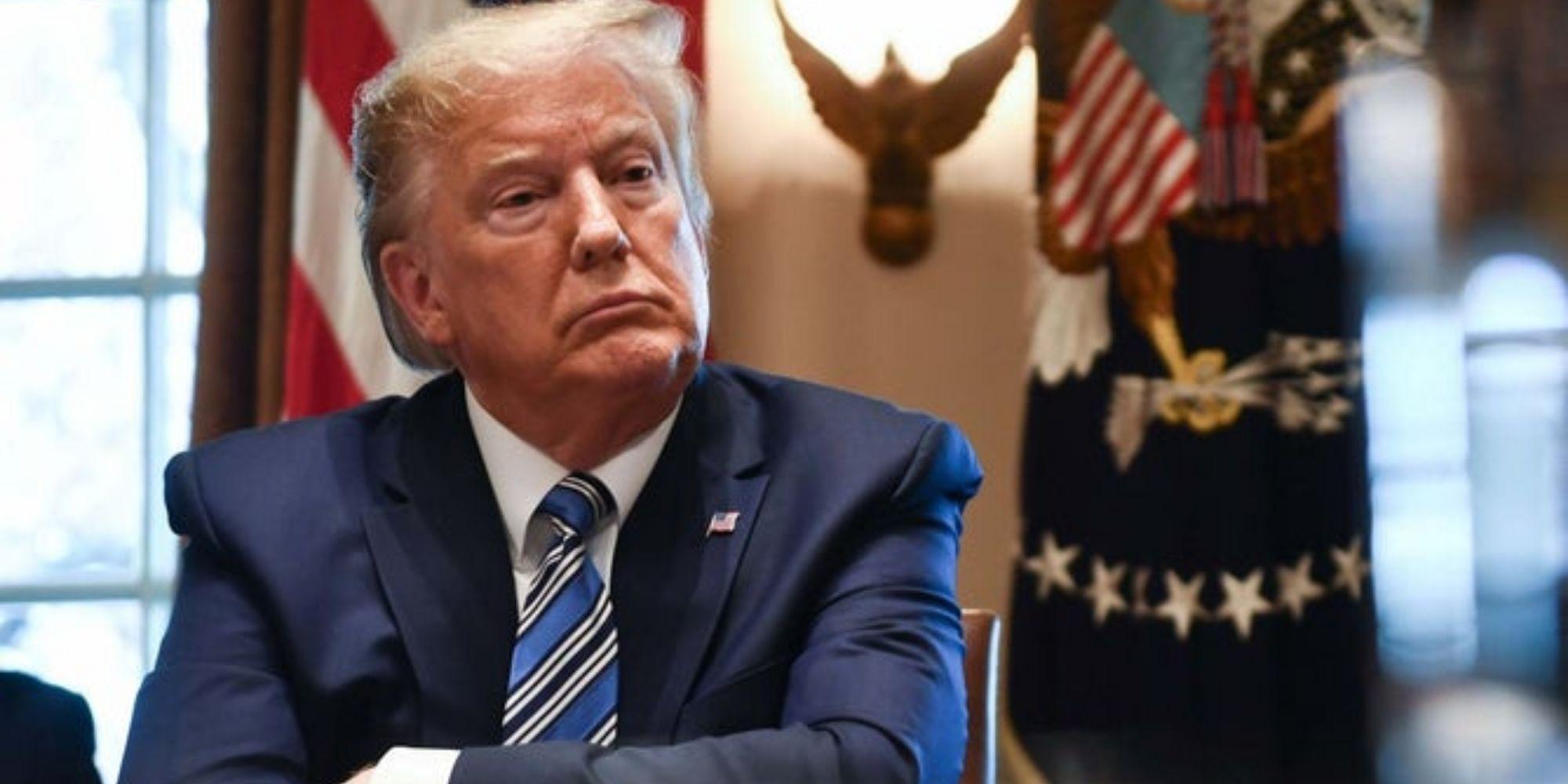
The outbreak of coronavirus has now become a global health concern. Italy has been put into a country-wide lockdown, the state of California effectively declared a state of emergency after one single fatality, President Trump has now announced a full ban on travel from Europe to the US, and citizens in many countries are being advised to consider self-isolation should they exhibit any potential symptoms. While these would appear to be reasonable contingency measures, it is important that we remain attentive to the discriminatory politics at work.

The problematic assumption that certain humans bring death through infection is well documented. During the first outbreak of the Black Death in Europe, we see clear signs of antisemitism appearing (some believe for the very first time in a truly systematic way) with the massacres of Jewish communities who were blamed for bringing the disease into Europe (from the Far East along the silk routes through Northern Italy). While many Jewish communities were destroyed from Barcelona to Basel, in Strasbourg on 14 February 1349 some 2000 Jewish persons were burned alive in the Valentine's Day massacre.

As the plague spread throughout Europe, notably in France, there was a need to partition populations into infected versus non-infected, healthy versus unhealthy. As the sociologist Michel Foucault once explained, this gave rise to the first census based on recording infection and the very idea of the modern state was thus born. This idea of healthy versus unhealthy life would become pivotal in the design of the first modern city, Baron Von Haussmann’s Paris – whose very system of planning was based on the ideas of human circulation (like a system of arteries) as previously discovered by William Harvey.


BIO POLITICS
The notion of circulation here has proved to be central to how we have ordered, governed and regulated all forms of life – from the local to the planetary. In the context of Paris, as elsewhere, the idea of health was a political convenient way for instigating a widespread transformation in the ecology of life. This was a pivotal lesson: Life is never static. It is vital. And its politics always biologically framed.

It is also worth noting one of the greatest artists to have ever lived, Michelangelo Merisi de Caravaggio, lost most of his family to the bubonic plague. He nearly contracted it himself as all the infected in Italy at the time were put into prisons where he was serving a sentence. No artist has since mastered the use of black with such dramatic potency.


If healthy life was all about encouraging positive forms of circulation, our very conception of freedom demanded its regulation. But racial prejudice was already loaded into this system. This was especially the case when the capacity or potentiality for contagion was factored in. Cities like Mexico City, for example, were compartmentalised between vibrant populations (white mestizo) and unhealthy (indigenous). Such ghettoisation would have a marked impact on the urban mapping of racial politics.

Throughout the 20th Century, we have seen the worst effects of the politicisation of health and viral infections. Relying upon forms of propaganda and political animalisation, the strategy of comparing humans with vermin (the carriers of disease) has been apparent in nearly every modern genocide, from the Holocaust to Rwanda. It is far easier to exterminate human life if it appears like some infectious rodent or cockroach.

What is bringing fear to populations today is precisely the indiscriminate nature of the virus. In many ways, this is similar to the logics that governed the wars on terror, whose violence was also indiscriminate in its arbitrary selection of victims. The effects of violence and death seem to be tolerable if they can be targeted and only concern certain groups. When however, we become the potential victim, the narrative changes.

With each passing day we are now subjected to the terror of the numbers, more infections recorded, and more deaths announced. Leaving aside issues about how headline numbers are limited when informing about who exactly are truly vulnerable, we could only imagine what this same alarmist approach might look like if it was replicated for other preventable diseases such as the spread of HIV in Africa (a disease again that was loaded with political symbolism) or even deaths from homelessness back home.

While governments around the world are therefore presenting a range of emergency measures, the question of who are presented as being the contagious and whose lives truly matter needs to be accounted for. We need to be vigilant to the subtle racial politics at work, and the ways the virus can be politicised to police and regulate the flows of human traffic in ways that the naked appeal to sovereignty alone could never achieve.

So, as cruise ships full of relatively wealthy Europeans sit docked on various coastlines like some newly discovered JG Ballard novel, maybe it is time to remind ourselves of the real dangers here.

Brad Evans is professor of Political Violence and Aesthetics at the University of Bath

THE INDEPENDENT 
Meteoric spread of coronavirus in the US is down to Trump wanting 'low numbers', experts suggest

12/3/2020 by Moya Lothian-McLean

Brendan Smialowski/AFP/Getty

Despite Donald Trump’s sniffily speech from the Oval Office yesterday, the coronavirus crisis in the US does not seem to be abating.

Officials warned it’s “going to get worse” as cases rose to over 1,000 across the country and Donald Trump announced a European travel ban – excluding the countries he has resorts in

In comparison, Asian countries like Vietnam and South Korea have managed to slow the spread of coronavirus using diligent testing and tracing methods. Vietnam has currently reported only 33 cases of coronavirus, with no fatalities at the time of writing.South Korea has had over 7,000 cases and 66 deaths, a fatality rate of 0.9 per cent, with the rate of new cases reported dropping from 909 to around 114 a day.

So people are starting to ask how the virus has spread so quickly in the USA, a wealthy, ‘developed’ country with a well-oiled – if extortionately expensive – healthcare system. Experts are posting their theories on Twitter – and they’re pretty compelling.

Congressman Ted Lieu, who has extensive experience in foreign policy, outlined his thoughts on how the outbreak had exploded so quickly and why Trump failed to contain it.

“By focusing on China, he failed to stop the virus coming in from other countries,” he posted, before also highlighting the lack of testing as a factor.
Meanwhile, world renowned economist Nouriel Roubini attributed the spread to the lack of testing, thanks to Trump refusing to acknowledge the problem and wanting to keep numbers “very low”.

Which works; data can’t show the spread of an epidemic if you simply refuse to collect it!
ABC journalist James Longman also blamed the lack of available testing but added that no nationwide healthcare system meant tracking cases was proving extremely difficult.

Richard N Haass, president of the Council on Foreign Relations (aka he is important) said that a ban was needed on large gatherings, rather than travel, as the disease was already in the US. Trump finally agreed to postpone a planned campaign rally after Democratic rivals suspended theirs as the outbreak worsened.So basically, the US is in such a worrying position because authorities didn’t test, trace or take action to make sure the public could self-isolate with support.Absolutely nothing to worry about in the UK then

---30---

Experts can't work out why coronavirus is spreading so slowly in Africa

Posted  by Louis Staples in people
UPVOTE
Image: Getty
Since the coronavirus pandemic began spreading across the world, experts have been fairly united in the belief that it’s an extremely serious threat.
But there’s one part of the world that’s dividing opinion in the public health community: Africa.
Other continents, from North America to Europe and Asia, have struggled to contain the pandemic, with cases continuing to rise everywhere outside China – yet Africa has registered a tiny number of confirmed cases by comparison.
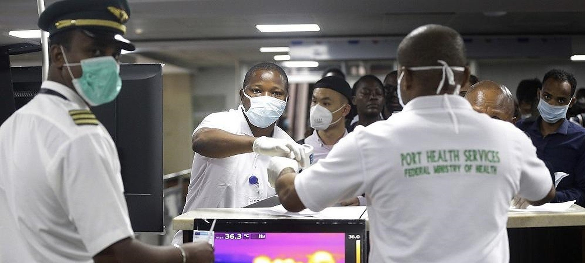
France 24 reported that on 1 March Africa only had three confirmed cases. According to the most up-to-date figures from the World Health Organisation, this number is currently 101 across 11 African nations (Algeria, Burkina Faso, Cameroon, Democratic Republic of Congo, Egypt, Nigeria, Senegal, South Africa, Tunisia and Togo). This is a tiny figure in such a populous continent, given that there's over 500 in the UK alone and 10,000 in Italy.

There have been no recorded deaths of coronavirus in the entire continent of Africa so far. But why?

There could be numerous factors influencing Africa’s low tally. It could be faulty detection, climatic factors or simple fluke. But the low rate in a continent with infamously fragile health systems continues to perplex (and worry) some experts.
Shortly after the coronavirus appeared, there were warnings of the virus spreading quickly in Africa because of the continent’s close commercial links with Beijing and its fragile and inconsistent medical services. On 22 February Tedros Adhanom Ghebreyesus, the head of WHO, told African Union health ministers gathered in Ethiopia:
Our biggest concern continues to be the potential for Covid-19 to spread in countries with weaker health systems.
In a study published in The Lancet medical journal, a team of scientists identified Algeria, Egypt and South Africa as the most likely to import new coronavirus cases into Africa. Thankfully, though, the study also noted that these countries have the best prepared health systems in the continent.

But other experts admit that “nobody knows” why coronavirus hasn’t become more widespread in Africa.

Professor Thumbi Ndung’u, from the African Institute for Health Research in Durban, said:
Perhaps there is simply not that much travel between Africa and China.
But Ethiopan Airlines – Africa’s largest airline – never even suspended flights to China. Chinese airlines even resumed flying to Kenya, and no spike in cases was detected.

Africa’s hot climate could be a factor.

Professor Yazdan Yazdanpanah, head of the infectious diseases department at Bichat hospital in Paris, said:
Perhaps the virus doesn’t spread in the African ecosystem, we don’t know.
But Professor Rodney Adam, of the infection control task force at the Aga Khan University Hospital in Nairobi, doesn’t agree.
There is no current evidence to indicate that climate affects transmission.
While it is true that for certain infections there may be genetic differences in susceptibility...there is no current evidence to that effect for Covid-19.

Africa's history might have made it well-equipped to respond to viruses and diseases.

The Lancet study found that Nigeria is one of the best prepared in the continent to handle an epidemic like coronavirus.
Mathias Altmann, an epidemiologist at the University of Bordeaux, told France 24 that Africa’s history of responding to epidemics might have made them more adept at how to stop viruses from spreading.
Neighbouring countries are less able to respond than Nigeria. But Altmann says that also an advantage: that people are often outdoors. He said:
Viruses like this one prefer closed spaces and are less likely to spread in a rural setting.
Whatever the reason, it's a hugely positive thing that, so far, Africa seems to be responding effectively to the pandemic. And it's fascinating that sometimes even experts can't agree on exactly why something is happening. 
H/T: France 24