PRISON NATION USA
Updated charts provide insights on racial disparities, correctional control, jail suicides, and more
New data visualizations expose the harms of mass incarceration
by Mike Wessler,
May 19, 2022
Here at the Prison Policy Initiative, we know a strong visual can drive home a point, change someone’s mind, or spur a person to action. It is why data visualizations are a core part of our research and communications strategy.
We usually only update our data visualizations about mass incarceration when a new report or briefing requires it. However, some graphs are so powerful that they warrant special treatment. In recent months, new data has been released about jail suicides, racial disparities, probation, and state incarceration rates. So we’ve updated a few of our most impactful charts with this new data to equip advocates, lawmakers, and journalists with the most up-to-date information available.
Racial disparities in the criminal legal system
From arrest to sentencing, racial and ethnic disparities are a defining characteristic of our country’s criminal legal system. The system of mass incarceration particularly targets Black people, who are 13 percent of the U.S. population but are 38 percent of the people in jails and prisons.
These updated charts show how people of color, particularly Black and Native American people, are disproportionately incarcerated in the United States.
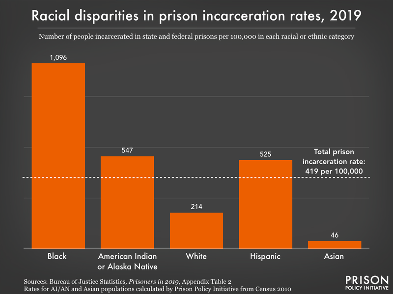
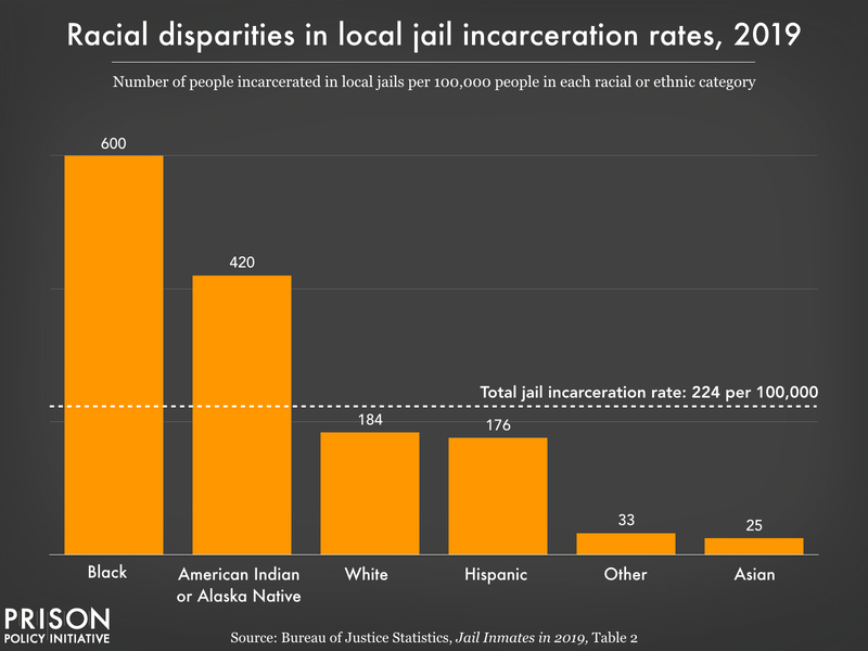
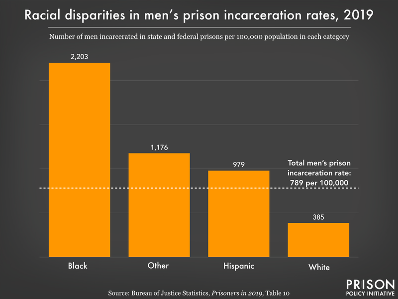
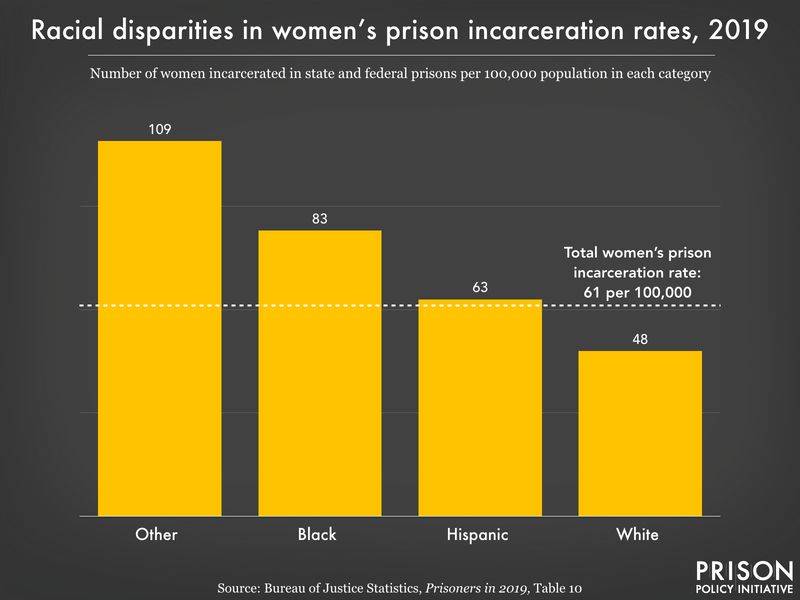
The original version of the charts showing racial disparities in incarceration rates was published in The U.S. criminal justice system disproportionately hurts Native people: the data visualized. The original version of the charts showing racial disparities in prison incarceration rates by sex was published in Visualizing the racial disparities in mass incarceration.
Visit our Racial Justice page for more reports, briefings, research, and visualizations focused on the intersection of race and mass incarceration.
State policies drive mass incarceration
While the activities of Congress often grab headlines, it’s state legislatures that have a chance to make the most progress toward ending mass incarceration.
That’s because, as these charts make clear, state governments and their policies are responsible for the vast majority of people incarcerated in this country. And while the COVID pandemic has led to recent drops in incarceration rates, without intentional action from the states, these reductions will almost certainly be short-lived.
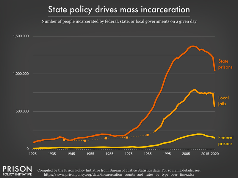
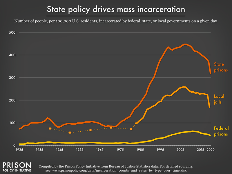
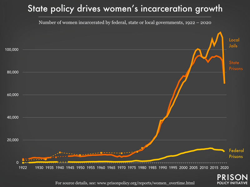
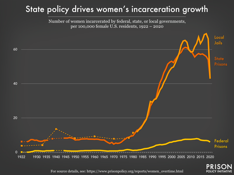
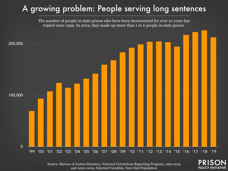
The original version of the charts showing how state policy drives mass incarceration was published in Tracking State Prison Growth in 50 States. The origina version of the charts showing how state policy drives women’s incarceration growth was published in The Gender Divide: Tracking Women’s State Prison Growth. The chart “Long sentences” was originally published in Eight Keys to Mercy: How to shorten excessive prison sentences.
Suicide is the leading cause of death in jails
Suicide is the single leading cause of death for people in jail, a fact that isn’t surprising considering the mountains of research that shows incarceration is inherently bad for a person’s mental health. As this updated chart shows, someone in jail is more than three times as likely to die from suicide as someone in the general U.S. population.
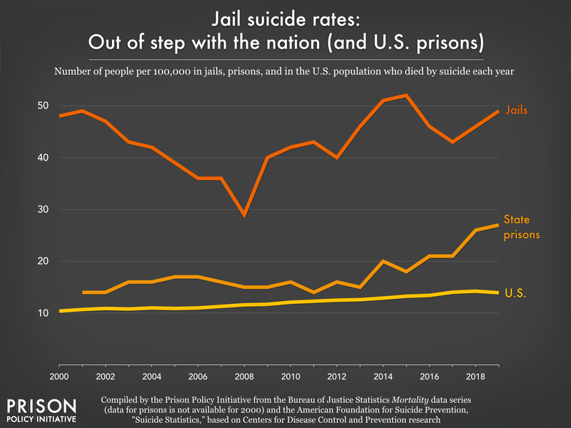
The original version of this chart was published in The life-threatening reality of short jail stays
The long arms of mass incarceration
For many people, their prison sentence tells only part of the story of their involvement with the criminal legal system. As a result of prohibitively high cash bail, they are often held in a local jail for weeks, months, or even years before they are convicted of a crime. And then, once they’re released from prison, they often remain under state supervision through parole for years, living with the constant threat of being jailed for a technical violation.
As these updated charts show, pretrial detention is the driver of jail population growth over the last 20 years, and roughly half of all people under correctional control are on probation. And despite recent pandemic-related reductions in these numbers, they’re still too high and likely to increase as pandemic slowdowns ease.
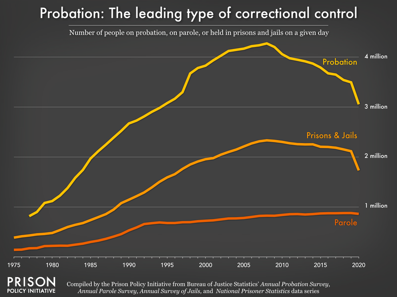
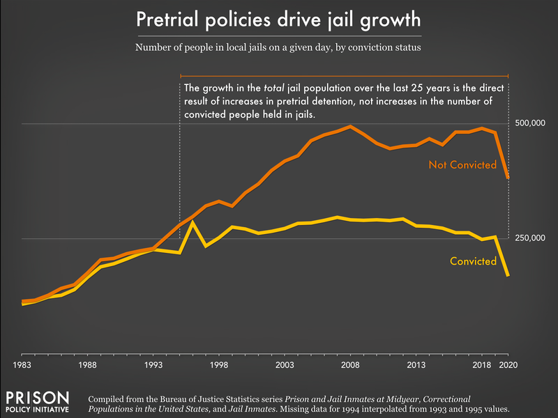
The chart “Probation Leading form of Correctional Control” was originally published in Probation: The nicest sounding way to grease the skids of mass incarceration. The chart “Pretrial policies drive jail growth” was originally published in Era of Mass Expansion: Why State Officials Should Fight Jail Growth.
Visit our Probation and Parole page for more reports, briefings, and visualizations that show that someone isn’t free just because they’re not behind bars. And check out our Jails and Bail page for more research on these institutions’ roles in the carceral system.
We’ve also updated the underlying data behind some of these charts in our data toolbox to empower advocates, lawmakers, and journalists to show the consequences of mass incarceration in their communities. If you’re using this data in your work, we want to know about it.
Related briefings:
The long arms of mass incarceration
For many people, their prison sentence tells only part of the story of their involvement with the criminal legal system. As a result of prohibitively high cash bail, they are often held in a local jail for weeks, months, or even years before they are convicted of a crime. And then, once they’re released from prison, they often remain under state supervision through parole for years, living with the constant threat of being jailed for a technical violation.
As these updated charts show, pretrial detention is the driver of jail population growth over the last 20 years, and roughly half of all people under correctional control are on probation. And despite recent pandemic-related reductions in these numbers, they’re still too high and likely to increase as pandemic slowdowns ease.
The chart “Probation Leading form of Correctional Control” was originally published in Probation: The nicest sounding way to grease the skids of mass incarceration. The chart “Pretrial policies drive jail growth” was originally published in Era of Mass Expansion: Why State Officials Should Fight Jail Growth.
Visit our Probation and Parole page for more reports, briefings, and visualizations that show that someone isn’t free just because they’re not behind bars. And check out our Jails and Bail page for more research on these institutions’ roles in the carceral system.
We’ve also updated the underlying data behind some of these charts in our data toolbox to empower advocates, lawmakers, and journalists to show the consequences of mass incarceration in their communities. If you’re using this data in your work, we want to know about it.
Related briefings:
No comments:
Post a Comment