Thursday, March 12, 2020

Visualizing the Wealthiest People in America & Their Generosity

Becoming a successful billionaire is the dream of many Americans. But often times people are more impressed by the charitable actions of billionaires, rather than by their success. This may be why Forbes included a new philanthropy score to its latest 400 billionaires list. Take a look at our chart below to see the wealthiest 30 Americans and their philanthropy score.
In the graphic above, the 30 wealthiest Americans are ranked from left to right. Each billionaire is represented by their name, the means by which they made their money, net worth and the new philanthropy score. The larger the billionaire’s net worth, the larger the green circle becomes. Philanthropy scores are measured on a scale of between 1 and 5, with 5 being the most philanthropic. If no charitable donations could be found, a philanthropic score of N.A. is applied. The data were collected from Forbes.

Top 10 Wealthiest American's & Philanthropy Score

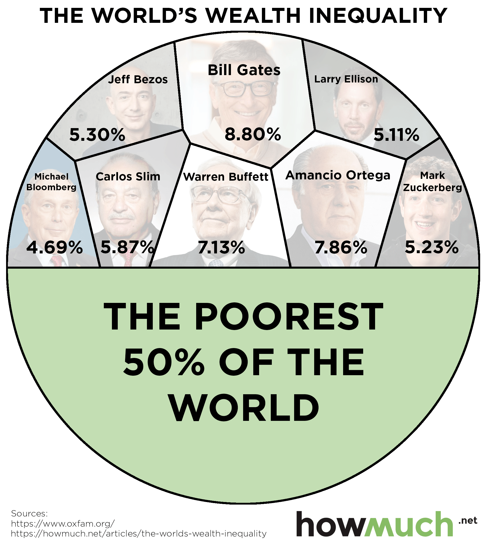
  • Jeff Bezos: $160 billion; 2
  • Bill Gates: $97 billion; 5
  • Warren Buffet: $88.3 billion; 5
  • Mark Zuckerberg: $61 billion; 5
  • Larry Ellison: $58.4 billion; 4
  • Larry Page: $53.8 billion; 4
  • Charles Koch: $53.5 billion; 4
  • David Koch: $53.5 billion; 4
  • Sergey Brin: $52.4 billion; 4
  • Michael Bloomberg: $51.8 billion; 5
The new Forbes 400 list had an unsurprising change: Jeff Bezos - the founder, chairman and CEO of online retail giant Amazon – has supplanted Microsoft co-founder Bill Gates as the world’s richest man. According to Forbes, Bezos has added $78.5 billion to his net worth in the past year, giving him a total net worth of around $160 billion. Bezos has received a lot of attention in 2018 for his meteoric rise, but his philanthropy score of 2 is far from the highest. In fact, the next three richest billionaires – Bill Gates, Warren Buffet and Mark Zuckerberg – all have a philanthropy score of 5, the highest possible score.
According to Forbes, the way the philanthropy score was derived partially based on a billionaire’s involvement with the Giving Pledge. The movement was created by Bill and Melinda Gates and Warren Buffet, with more than 40 other billionaires joining soon thereafter, in which billionaires promise to give away half or more of their fortunes. Jeff Bezos is not part of the Giving Pledge, which may help to explain is relatively lower philanthropy score.
There appears to be a correlation between the net worth of an individual and how much they give away to charity. The higher a billionaire’s net worth, the more they give away, not just in absolute terms, but in percentage terms as well. The further you go down on the billionaire’s list, the more ‘N/A’ philanthropy scores you see, as well as generally lower philanthropy scores in general. Forbes mentioned that in order to get a philanthropy score of 5, a billionaire had to give away at least $1 billion and/or 20% of their net worth. By that measure, only 29 of America’s 400 richest met that standard. George Soros gave away more than any other at a total of $32 billion, or 79% of his wealth, given to charity.
Jeff Bezos may now be the richest man in the world, but he is far from the most charitable. Billionaire’s are known for their philanthropy, but when it comes to charity, not all billionaires are created equal. If you ever become a billionaire sometime in the future, remember to give away as much as you can to get your philanthropy score to 5!

About the article


8 Billionaires Own as Much as 3.6 Billion People

If you want stark visual proof of global inequality, here it is. Both halves of this graph represent an equal amount of global wealth. The top half consists of the world's eight richest billionaires. The bottom half represents the poorest half of humanity – that's 3.6 billion people.
Such levels of global wealth inequality are “beyond grotesque”, says Oxfam, which released the findings. And that inequality continues to grow: in last year's report, it took no less than 62 billionaires to equal the wealth of the world's bottom half.
The eight richest persons in the world collectively own about $426 billion. That is an average of about $53.25 billion for each. For the bottom half of the graph, the average of their collective wealth works out to less than $120 per person.
You're certain to know some of the guys in the most exclusive club in the world – the rich list rock stars. Others shun the limelight, preferring wealth without fame. Six are Americans, the other two hailing from Spain and Mexico:
1. Bill Gates, the co-founder of Microsoft, is the richest man in the world. He is worth $75 billion (8.80% of the eight wealthiest billionaires' fortunes combined).
2. Armancio Ortega ($67 billion, 7.86%) is the richest man in Europe. He is the founder of the Zara clothing brand and chain.
3. Warren Buffett ($60.8 billion, 7.13%) is an investment guru, best known for his holding company Berkshire Hathaway.
4. Carlos Slim ($50 billion, 5.87%) made his money via America Movil, a major telecommunications multinational operating mainly in Latin America.
5. Jeff Bezos ($45.2 billion, 5.30%) founded Amazon, which expanded from a web-based book shop to the undisputed worldwide online retail giant.
6. Mark Zuckerberg ($44.6 billion, 5.23%) founded Facebook back in 2004 and grew it into the world's favorite social media platform.
7. Larry Ellison ($43.6 billion, 5.11%) founded software giant Oracle.
8. Michael Bloomberg ($40 billion, 4.69%) founded Bloomberg LP, a financial and media giant, and was mayor of New York City.
The fact that this year it takes only 8 billionaires to equal the wealth of the world's poorest half is due to two main factors. Firstly, it turns out that poverty in China and India is worse than previously thought, meaning the bottom half is even worse off.
But, crucially, the wealth accumulation into the hands of an ever smaller number of super-rich continues. Oxfam points to wage restraints for lower- and middle-class incomes, a focus on increasing returns for shareholders and executives, and tax evasion by the wealthy as factors contributing to the ongoing phenomenon.
Oxfam states that since 2015, the richest 1% of the world own more than the other 99%. released its figures ahead of the World Economic Forum (17-20 January in Davos, Switzerland). The WEF has acknowledged rising inequality as a major risk to the global economy, and a potential driver for a reversal of globalisation.
Countering Oxfam's shocking report, some observers defend global capitalism by pointing out that free markets have helped over 100 million people rise out of poverty in the last year alone.

Mapping Extreme Poverty Around the World

A new report from the World Bank just landed, finding that a record low of 10% of humanity now live in extreme poverty, down from 11% in 2013. But poverty rates aren’t anywhere close to equal between continents or even countries, as our new series of maps clearly demonstrates.
The World Bank provides an in-depth explanation for its methodology, which you can find in Appendix A of the full report here. We focused on the percentage of people in each country living below what the World Bank defines as extreme poverty, or $1.90/day. We’ll let the researchers defend this definition on their own, but there is one caveat to keep in mind. It can be extraordinarily difficult to collect reliable data from so many countries on a regular basis, and in fact we used the latest year in which numbers were available whenever possible. For example, in some of these maps we compare 2011 figures against 2015. In short, our maps provide the clearest possible apples-to-apples comparison for extremely poverty from around the world.
To start, there are several dark and light green countries scattered around the globe, from the United States down to Argentina and from Russia to Australia, there are lots of developed countries where very few people experience a subsistence standard of living. This is what people mean when they refer to the global North and South. To be fair, there are also several gaps in the available data in places like Saudi Arabia, Afghanistan, Poland and Greenland. But none of these countries would change the overall story, that developed countries are much wealthier than everyone else.
It’s clear that the one continent with the most extreme levels of poverty is Africa. There are only five countries on the entire landmass where less than 5% of the population lives in abject poverty, and in fact most places have levels well over 25%. The only group of green countries is clustered to the north along the Mediterranean, notably the ones closest to Europe and furthest from the heart of Africa. The Democratic Republic of Congo (77.1%) and Madagascar (77.6%) are at the epicenter of global extreme poverty. They are the 2 poorest countries on the planet, where it’s far more common to find someone living on less than $2/day than not.
There’s no better continent to illustrate the differences between the global North and South than Asia, but the 2 countries deserving special consideration here are China (0.7%) and India (21.2%). China has pursued an aggressive modernization effort under authoritarianism and one-party rule. By contrast, India is a democratic republic also undergoing a massive transformation. And according to PwC both countries will have economies larger than that of the United State by the year 2050. We’ll have to wait and see how the ongoing trade spat with President Trump changes these dynamics (or not).
South America also has an interesting story to tell. Keep in mind, the World Bank’s numbers are the latest available, which means 2015 or even 2011 for some countries. We mention this because the situation in Venezuela has rapidly deteriorated over the last few years with about 2 million people fleeing the country and inflation hitting 200,000%. Surinam (23.4%) and Honduras (16.0%) also stand out as pockets of deep poverty in the Western Hemisphere, and in fact many of the people in the caravan of migrants heading to the United States through Mexico originated from Honduras.
Skipping across the Pacific Ocean to Australia, we find a developed English-speaking country in Australia (0.5%) very close to countries in abject poverty like Papua New Guinea (38.0%) and Timor-Leste (30.3%). That being said, Australia generally has far friendlier immigration policies than other developed countries, so much so that one could say it has an “immigration economy.”
The winners in the global economy today are the same countries that colonized places life Africa and South America years ago. Indeed, the world looks decisively different in Western Europe, where only one country, Romania, has more than 5% of its population living in extreme poverty. Almost every country has fewer than 1% living in such a condition, and many report 0.0%. Social democracies with developed economies and rich in natural resources—there’s no wonder why so many immigrants want to move to the West.
And lastly, consider North America, where the rate of extreme poverty declines the further north one travels from Mexico (2.5%) to the United States (1.2%) and Canada (0.5%). There is actually an interesting comparison here, which is to say that the United States is proportionally home to more people subsisting on $1.90/day than China (0.7%). That being said, there are substantially more extremely wealthy people in the US than any other country in the world, not to mention the world’s largest economy at $19.4 trillion.

About the article

Visualizing the Huge Disparities Between People's Wealth Around the World

Comparing wealth inequality numbers across several countries can be very tricky. Countries have different methodologies for calculating wealth. The cost of living varies dramatically within and between countries, plus there are all sorts of gaps in any dataset that incorporates information from Albania to Zimbabwe.
The Credit Suisse Research Institute has a highly respected approach in its Global Wealth Report. Credit Suisse defines “net worth” as the market value of all assets minus any outstanding debts. Researchers calculated average wealth numbers by for adults estimated to be living in each country. We took the figures (Table 2-1 in the report) and mapped them onto a heat map of the world. It’s important to note that average numbers like these can obscure crushing levels of poverty even in what appear to be wealthy countries, however they still provide an interesting snapshot of the wealthiest and richest countries in the world.

Looking at the average net worth across the entire world indicates the enormous disparity between the developed world and everyone else. At one extreme, there are countries with net worth numbers over $500,000, and at the other extreme, there are places where people have less than $500 to their names. There is a smattering or light orange countries in between, but the worldwide map demonstrates an astonishing level of inequality between the have’s and the have-not’s.
The story in North America is one of stark inequality. Northern countries like Greenland, Canada and the United States boast extremely high average figures. It’s no surprise that Americans are by far the wealthiest with $404K, but take a look at Mexico ($20.6K) and even the Bahamas ($47.8K). This means that the US is 10 times richer than the Bahamas and an eye-popping 20 times wealthier than Mexico.
South America on the other hand reports some rather depressing numbers. Chile has the highest average in the region at $62.2K, followed by the Cayman Islands and French Guiana (both at $55.3K). However, the average across all of Latin America is a tiny $24.4K. Haiti, one of the poorest places in the entire world, only has $2.5K per adult. That’s why immigration usually happens from the South to the North.
Europe is the most fascinating continent in our series of maps for a few reasons. There’s an obvious contrast between East and West running right down the middle of the region. Germany ($214.9K), the Czech Republic ($61.5K) and Austria ($231.4K) fall into the upper (green) tiers on our map, but right next door, countries like Poland ($31.8K), Slovakia ($34.8) and Hungary ($37.6K) remain far behind. And the further east you travel, the poorer the country. Ukraine ($1.6K) and Belarus ($1.5K) are both worse off than even the poorest countries in the entire Western Hemisphere. There’s another trend worth pointing out hiding behind our color-coded map, and that’s the difference in wealth between northern and southern European countries. In general, the further north and west, the wealthier the country.
The situation in Africa is simply depressing. Our map highlights the soul-crushing extreme levels of poverty found in places like Burundi ($321), Ethiopia ($167) and Malawi ($141). To put these numbers in perspective, the United States is well over 1,000 times wealthier on an average individual basis. There is one pocket of relative prosperity worth pointing out in Libya ($61.7K), but not even this is good enough to break the top 50 wealthiest countries in the world.
Our snapshot of wealth in Asia similarly provides an interesting view of the global economy. Take note of the line of relative poverty stretching from Syria in the west all the way to Vietnam on the Pacific Ocean. Now look at all the green countries, like Japan ($227.2K), South Korea ($171.7K) and Taiwan ($212.4K). Together with Singapore, Hong Kong, the UAE and Israel, these countries are all firmly aligned with American foreign policy and Western institutions. The wealth of these nations stands in contrast to adversaries like Russia ($20K) and China ($47.8K).
And finally, the picture of wealth in Oceania provides a nice bookend to our worldwide tour. Australia ($411.1K) and New Zealand ($289.8K) both stand out at the top of the pack, but some islands like French Polynesia, Palau and New Caledonia aren’t so far behind either ($203.9K each). Part of the explanation why is no doubt the robust and longstanding high-end tourism industries in these countries, which provide relatively strong individual wealth numbers.
Want to learn more about global poverty and inequality? Check out our other recent article on extreme poverty rates around the world.

About the article


This Graph Shows Where the Filthy Rich Live in the World

It is hard to visualize how much $500M is in real life. Imagine giving away $100,000 to charity every week for the next 50 years and there would still be hundreds of millions left over. People with this kind of money are the captains of global capitalism. They can afford to live wherever they want and most undoubtedly own several different properties around the world. We created a new graph to better understand which countries are the most likely to be called home by holders of such unimaginable personal wealth.
The data comes from Knight Frank, a real estate and property consulting company. They publish an annual Wealth Report analyzing the property, location, and attitudes of the extremely wealthy. Knight Frank counted the number of individuals with over $500M in personal wealth who live in each country. Each piece of our modified pie chart corresponds to the number of ultra-wealthy people with their primary residence in each county. We color-coded each country by continent, creating an easy to understand snapshot of the distribution of the ultra-wealthy around the world.
The U.S. immediately stands out as the most popular with 1,830 individuals worth over $500M. That’s more than four times as many half-billionaires as the second-place country, China (490). A quick note on methodology: we separated Hong Kong (320 people) from China for counting purposes. Though Hong Kong has officially been part of China since 1997, the situation remains complicated. Even if we combine mainland China with Hong Kong (810 people combined), it still wouldn’t be even half of the U.S. number.  Germany takes third place in the rankings with 490 people, followed by Japan in fourth at 390. Special mention should be made of Switzerland:  this small, landlocked country in the middle of Europe is home to 250 half-billionaires. We suspect the country’s notoriously private banking laws are the main reason so many of the 0.001% call it home.
Our chart clearly demonstrates that the ultra-wealthy are concentrated on three continents: North America, Asia, and Europe. What is it about these places that make them so hospitable to multi-millionaires? There are a few possible explanations. Every country with 100 or more of these super-rich individuals is a democracy with the rule of law. The two exceptions are China (which just passed a law allowing its president to remain in power for life) and Russia (which just held an election widely seen as a sham by outside observers). Natural resources also allow countries like Saudi Arabia and the UAE to make the list, but the wealth just isn’t shared among nearly as many people.
Let’s take a step back. Here’s a list of the top 10 countries ranked in order of the number of people with more than $500M in personal wealth.
1. U.S. (North America): 1,830 people
2. China (mainland) (Asia): 490 people
3. Germany (Europe): 430 people
4. Japan (Asia): 390 people
5. Hong Kong (China) (Asia): 320 people
6. Canada (North America): 270 people
7. Switzerland (Europe): 250 people
8. France (Europe): 230 people
9. Russia (Russia): 220 people
10. U.K. (Europe): 220 people
Studying the high end of the wealth spectrum reveals a lot about the global economy. People with that kind of money have the resources and financial freedom to live anywhere in the world, but they have often chosen to make their homes in a few select countries. By this measure, the United States seems to remain far and away the best place to live for the ultra-wealthy.

About the article

Visualizing the Wealthiest Billionaires Around the World in 2019

Becoming a billionaire is about as probable as being struck by lightning (i.e. NOT likely). If you live in North America your odds of becoming a billionaire are one in 785,166. Your odds of being hit by a lightning bolt are one in 750,000. If you defy the odds, you become a member of an elite club with less than 3000 members worldwide. While there are thousands of billionaires, each country has just 1 richest billionaire.
  • The average net worth of the 73 listed billionaires is $14.8 billion
  • Jeff Bezos, wealthiest billionaire in the world, has a net worth over 10x the average at $149.7 billion
  • Most common sources of wealth: Banking/Finance/Investments, Diversified (large conglomerates with multiple divisions) and real estate
  • 5 of the 73 listed are women
Our graphic takes data from the most recent Forbes billionaire list. The graphic shows the one richest person from the 73 countries listed. The image further groups the billionaires by their respective region (Americas, Asia, Europe, Africa), highlights the source of their wealth (i.e. Banking, Diversified, Mining etc) and their estimated net worth figure. Find out who your country’s richest person is below.

Top 5 Richest Billionaires By Wealth and Country

1. Jeff Bezos - $149.7B, U.S.
2. Bernard Arnault - $89.3B, France
3. Amancio Ortega- $63.7B, Spain
4. Carlos Slim Helu- $60B, Mexico
5. Mukesh Ambani - $52.9B India
The list of billionaires is impressive with many of them touting international celebrity status. Looking at the makeup of these individuals based on their geographic location also highlights some interesting takeaways. Here is a breakdown of what industries created the most wealth in each region:
  • Americas - Banking is the dominant player for wealth creation with over $306 billion of wealth created
  • Europe - Retail focused with many iconic brands (NutellaRedBullLVMHZARA etc) with $433.7 billion of wealth
  • Asia - Real estate is the wealth creator of choice with $271 billion of wealth
  • Africa - Commodities (Cement, Foodstuff, Diamonds etc) with $43 billion of wealth
While knowing how billionaires become rich is interesting, knowing how they spend their wealth is more insightful. Philanthropy of the world's wealthiest is big business. Some have been generous giving away nearly 1% to 2% of their net worth to date. The most generous are committing to giving half, if not all away.
The Giving Pledge founded by Bill and Melinda Gates, is an organization that seeks to convince the world's wealthiest people to give away half of their wealth to philanthropic endeavors. To date, 204 people have signed the pledge from 22 countries. Notable signers include Richard Branson, Warren Buffet, Bill Gates, Mark Zuckerberg and others. In terms of the wealthiest from each country, none are on the list with the notable exception of Mackenzie Bezos. Bezos, the ex-wife of Jeff Bezos, has a net worth of $36 billion and has committed to the Giving Pledge.
The Giving Pledge has notable billionaires but none that top the wealthiest list from their respective countries. The pledgers tend to be couples and from North America which has the greatest concentration of billionaires in the world. The U.S. has more billionaires than China, India and Germany combined. As the world’s billionaire population becomes more global, one would hope that philanthropy also follows suit.
About the article
Published: 13 June 2019

Mapping the Population of Global Millionaires in 2019

More millionaires live in the U.S. than any other country in the world, and it’s not even close. That’s according to the 2019 Global Wealth Databook by Credit Suisse. Here’s how the U.S. compares to the rest of the globe.
  • The U.S. has 18.6M millionaires, more than any other country in the world.
  • Europe has more millionaires than Asia, with the U.K. (2.5M) leading the continent followed closely by Germany (2.2M) and France (2.1M).
  • China (4.4M) is home to the most millionaires in Asia, followed by Japan (3.1M).
  • South America (673K) and Africa (171K) are almost entirely missing from our map because so few people are millionaires in those places.
The numbers behind our map come from the 2019 Global Wealth Databook by Credit Suisse. You can read about the researchers’ detailed methodology in the report itself. We created a map using one dot to represent 1,000 millionaires, color-coding each country by continent. Credit Suisse grouped a number of countries with a small number of millionaires together under “other” and we placed them in the top right corner. This lets you easily and quickly see where millionaires live, and where they don’t, providing a snapshot of global wealth.

Top Countries Where the Most Millionaires Live

1. U.S.: 18,614K
2. China: 4,447K
3. Japan: 3,025K
4. United Kingdom: 2,460K
5. Germany: 2,187K
6. France: 2,071K
7. Italy: 1,496K
8. Canada: 1,322K
9. Australia: 1,180K
10. Spain: 979K
For starters, the United States has by far the most millionaires of any country in the world, with over 18 million people. That’s more than four times as many as second-place China. And just like how millionaires tend to come from some countries and not others, they also tend to live in some states, especially young millionaires. In any case, there’s no doubt a lot more rich people in America than anywhere else in the world.
That being said, there’s no shortage of millionaires in Europe and Asia. The U.K. (2,460K) is home to more millionaires than any other country in Europe, followed closely by Germany (2,187K) and France (2,071K). Eastern Europe is noticeably small with only a handful of countries making it onto our map. Russia is tiny (246K). Keep in mind our map doesn’t adjust for the size of a country’s population. Japan (3,025K), South Korea (741K), Taiwan (528K) and Hong Kong (516K) therefore appear much bigger than they do on a physical map, indicating just how wealthy these developed countries have made some people.
There are two continents almost entirely missing. South America only has a few countries appearing on the map, Brazil (259K), Colombia (27K), and Chile (64K). Africa only contributes two in Egypt (46K) and South Africa (46K). In fact, an enormous portion of the world’s population still lives in extreme poverty, and our map illustrates the stark wealth inequality between developed countries and everywhere else.
Why do you think the U.S. has so many rich people? Let us know in the comments.

About the article

Income Inequality Around the World: How Much do You Need to Earn to Join the Top 1%?

You’re not wrong to be curious about income inequality. Politicians on both sides talk about it all the time, and the media is obsessed with stories about the top 1%. Our map takes a unique look at inequality by focusing on the threshold of income needed to join the top 1% compared to the top 50% for several countries around the world.
  • The United Arab Emirates has the most unequal distribution on our map. The money needed to join the top 1% is $922K compared to $22K for the top 50%.
  • The threshold to join the top 1% of income in the U.S. is almost 13x bigger than the top 50%.
  • The U.K., France and Germany have similar numbers for the amount of income needed to be in the 50% threshold ($36K).
  • India is one of the poorest countries on our map. It takes only $4K of income to meet the 50% threshold of income and $77K to be in the top 1%.
Inspired by an idea from Bloomberg, we analyzed a handful of countries from different regions around the globe. These countries aren't necessarily representative of their respective regions. We figured out how much money it would take to be in the 50th percentile of income for 14 different countries around the world from The World Inequality Database, comparing it to the threshold needed to join the top 1%. We used the latest available set of numbers available. We pulled data for Canada from Statistics Canada taking into consideration purchasing power parity (PPP) according to the OECD.

Top 10 Countries on Our Map With the Highest Threshold to Join the Top 1% income

1. United Arab Emirates: $922K
2. United States: $488K
3. Bahrain: $485K
4. Germany: $277K
5. United Kingdom: $248K
6. France: $221K
7. Canada: $202K
8. South Africa: $188K
9. Brazil: $176K
10. Russia: $174K
There are some big gaps on our map between the income needed to join the top 50% and the top 1%. The UAE has the most unequal distribution of income on our map, with $922K needed to join the top 1% compared to just $22K for the top 50%. That stands in stark contrast to India, where $77K is enough income to make it across the threshold of the top 1% in the country.
Consider the relationship between inequality overall and how much people in the 50th percentile make. For example, the U.S. definitely has some substantial inequality, but middle income Americans make more money ($38K) than any other country in our visualization. Germany, France and the U.K. are also unequal overall but relatively high incomes for the 50th percentile ($36K). Compare that to the situation in Brazil and South Africa, where middle income workers earn roughly 7x less than in the U.S..
There are a couple things to keep in mind about our map. It only contains numbers for 14 different countries. There are also big differences in inequality inside countries like the U.S. There’s a lot that can be said about comparing wealth instead of income. And finally, our map doesn’t consider the types of services each government provides for its citizens. People in one country might have guaranteed retirement pensions (like France used to) and healthcare, but many Americans don’t have access to these types of things outside of their workplace.
So there’s lots of inequality around the world, but is that necessarily bad for middle income workers? Let us know your thoughts in the comments.

About the article

Are Today’s Billionaires Born or Self-Made? This Map Shows You the Answer

Every nation must have someone who is the wealthiest, and everyone who vies for this honor is faced with the same daunting question: How? You’ve likely heard that wealth comes from hard work, but unfortunately to make it to the top spot that’s only true if you’re working hard at growing your own wealth. Of those richest people in each nation, 52% were born in the right family, as shown in the map below.
The good news is that those most richest who are self-made tend to have greater wealth, to the tune of 58% greater average wealth. By wealth, the top three people richest within their nation are all self made: Bill Gates in the US ($79.4 billion), Amancio Ortega of Spain ($78.7 billion, briefly surpassing Bill Gates to reach the #1 spot today), and Carlos Slim in Mexico ($62.8 billion). This far outstripps the largest inherited wealth on the map (Liliane Bettencourt of France at $43.3 billion).
Becoming the richest by self-made means requires a fundamental change in the way a nation distributes its resources and wealth. From retail to infrastructure to tech, getting wealthy by starting or buying a business requires that business to grow at breakneck speed to surpass the value of long-established companies, creating changing not only the industry but the national economy. If you’re born into it, your top spot is given to you by maintaining the status quo, but those self-made people who make their way to the top do so by taking their wealth; either by starting a new business, reforming a troubled business, or investing in a variety of different businesses during a time of economic volatility. For example:
  • In the US, Bill Gates in the US whose $79.4 billion was earned by disrupting the tech sector facilitated by low entry costs and an environment of intense competition.
  • Likewise, in Spain, Amancio Ortega briefly surpassed Bill Gates as the richest person in the world, succeeding in doing so by dominating the global clothing industry, which has netted him $79 billion since he first began as a shop hand.
  • In China, Wang Jianlin’s $32.1 billion has come out on top in the nation with the most billionaires in the world by investing in troubled companies, as well as solid but undervalued companies during times of socioeconomic uncertainty.
  • In Brazil, Jorge Lemann, whose $24.4 billion was largely the result of his purchase of large stakes in companies during times of economic turmoil, as is typical, since wealth based purely on investing requires a large degree of volatility to create gains.
  • In Russia, Mikhail Fridman’s $14.6 billion was also made through a variety of investment and start-ups, starting with a small window cleaning service which then expanded into a much more diversified portfolio.
  • In the UK, the $15.5 billion is attributed to the Hinduja Family, specifically four brothers who began working in textile exporting before getting their first big injection of income after buying the rights to a movie which turned into a surprisingly large success.
  • In France resides the world’s richest person by inheritance, Liliane Bettencourt, whose $43.3 billion was given to her by her parents, who both owned the company L’oreal, and had political involvement.
  • Canada’s David Thomson, worth $26.2 billion, was handed the fortune which was first created by his grandfather, the media mogul who owned Thomson Reuters.
One might be forgiven for thinking that around the world, the richest of the rich were all born into their money. After all, a self-made person would have to accumulate wealth so quickly that within one generation they surpass a family that’s been accumulating it for several. Looking at the map, though, it becomes clear that self-made & inherited wealth are pretty even in today's world.

About the article