Area burned is closely tracking the record wildfire year of 2007, but carbon emissions appear to be higher.
HANNAH RITCHIE
JUL 31, 2023
https://www.sustainabilitybynumbers.com/
The headlines have been filled with record-breaking temperatures, heatwaves, and wildfires.
Wildfires in Greece have been a leading story here in Europe. This has inevitably led to debates about whether these fires are worse than normal, or whether it’s “just another year”.
I took a dig into the data to see.
The European Forest Fire Information System (EFFIS) – part of the EU Copernicus program – tracks wildfire burn across Europe. That’s the data that I’ll use here since it provides weekly breakdowns, not just annual totals. At the end, I’ll look at longer-term data that is only reported on an annual basis.
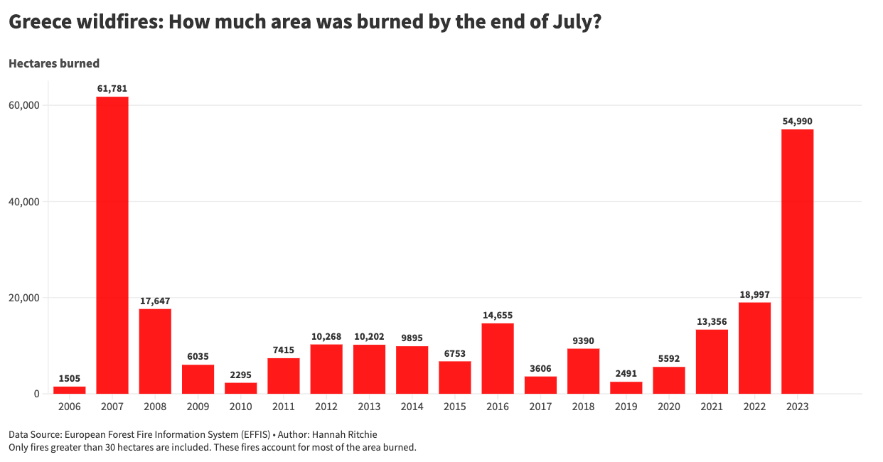
Of course, we’re only at the end of July so let’s compare the wildfire burn up to this point of the year. In the chart, I’ve shown the end-of-July burn for every year since 2006. As you can see, it has already been a very large year for wildfires.
2007 was extremely bad in Greece. This year is not far behind: 55,000 hectares have burned so far, compared to 62,000 in 2007.
Would we expect more area to be burned in the next few months? Is it common for wildfires in Greece to continue into August and September?
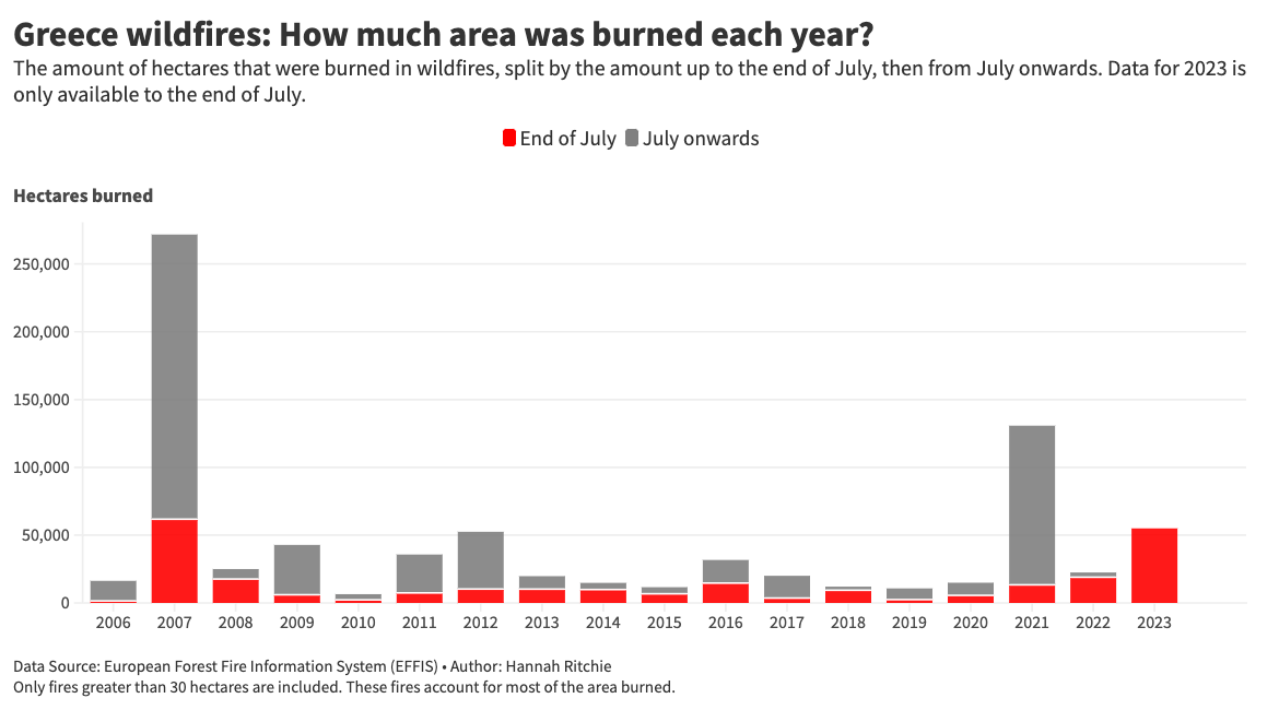
In the chart below I’ve added the data from August onwards.
Often, most of the wildfire burn can happen later in the year. In 2007, three-quarters of it. The same is true for the second-largest year, 2021.
That’s bad news: Greece has already been hit badly by wildfires this year, and historical data would suggest that it could face a lot more in the next few months.
Finally, we can take a finer-grained look at how wildfires tend to evolve week-by-week. In the chart below we have the same data – cumulative area burned – but zooming in on weekly records. Each line is one year.
For comparison, I’ve shown the 2006 - 2022 average, plus 2007 and 2021 which were the two largest burns. In the interactive chart, you can add and remove other years to explore the data in more detail.
Look at the 2023 line compared to 2007. It was a large week of burning from the 15th to the 22nd of July this year. The cumulative burn was actually ahead of 2007. But the rate of burn appears to have slowed in the past week, bringing it in just behind 2007 by the end of July.
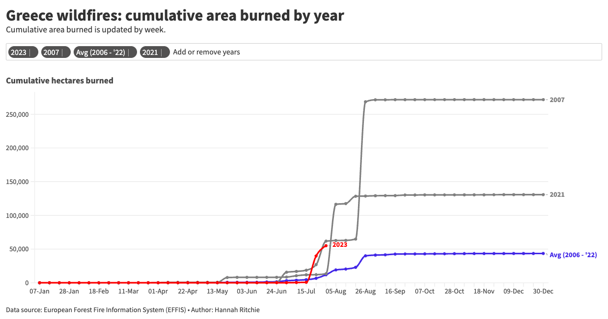
The wildfire season tends to finish at the end of August. You can see this because the lines tend to ‘level off’ by the end of August. Very little area is burned after then.
In 2007, three-quarters of the annual burn happened in August. In fact, nearly all of it in just one week from the 19th to the 26th. A staggering 200,000 hectares were burned.
It’s not just the total area burned that matters for the impact of wildfires
The total area burned is just one measure of the damage and impacts of wildfires (albeit a very important one).
What’s crucial for the human impacts of these fires is where they happen; how quickly they break out; and how they’re managed locally.
A clear example of this was the 2018 wildfire season, where at least 100 people died. It was Greece’s most deadly year in decades, but you wouldn’t guess this from the previous chart of the total area burned: 2018 was a pretty low year.
In 2018, a series of fires broke out along the seaside region of Attica and engulfed the village of Mati. The fire spread very quickly, making it one of the country’s deadliest, despite the overall wildfire season being short-lived.
More people were killed in 2018 than in 2007, despite less than one-tenth of the total area being burned.
This year’s fires have broken out near highly-populated areas – in particular, the popular spot of Rhodes – leading to some of the country’s largest evacuations. The Ministry of Climate Change and Civil Protection has said it is the “largest evacuation from a wildfire in the country”.
For emissions, it’s not only the area burned that matters but also the type of vegetation – and its carbon density – and the intensity.
Reports from the Copernicus programme suggest that the fire intensity this year has been the highest for July since records began. And this has translated to the highest recorded carbon emissions for July since 2003. Emissions are much higher than they were in 2007 at this stage in the year, despite having slightly less area burned.
Full disclosure: I couldn’t get some of these carbon numbers to add up so if anyone is an expert in this area, or is up for some detective work, I left a query in the footnote.1
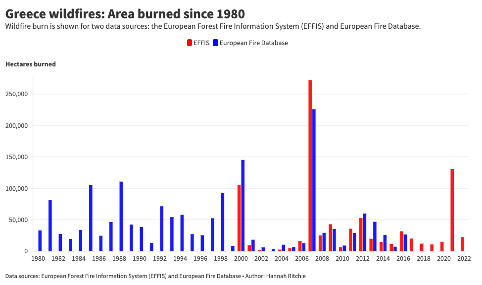
Greek wildfire trends since 1980
Weekly data is only available from the EFFIS as far back as 2006. But we’d ideally look at some longer-term data too.
There is no single dataset that extends back further in time and includes data from the last few years. Data from the European Fire Database goes back to 1980 but stops in 2016. EFFIS annual data is up-to-date but only goes back to 2000.
To get a longer dataset, we’ll have to combine them. In the chart below I’ve plotted both. You will notice that they don’t exactly match, but are pretty close and suitable for the comparisons we’re doing here. The overall trends and magnitudes are the same.
We can see – regardless of what data source we use – that 2007 was not only a big year for the 21st century. It has been the biggest year since 1980, by far.
What’s interesting is that the average wildfire in the 1980s and 1990s was larger than it is post-2000. There was much less variability from year-to-year. Now, we have ‘smaller’ years followed by very large burns. Wildfires from 2000 to 2006 were small but then followed by a massive burn in 2007.
The European Environment Agency (EEA) notes that this is a common trend across Europe. Forest fire risks – measured by the Fire Weather Index (FWI) – have gone up. But the average area burned has trended downwards as a result of fire management and suppression efforts.2
Suppression efforts, without planned and controlled burns, can lead to large burn years. Dry vegetation and burning material can build up, leading to very large fires in particularly hot years. This is exacerbated by climate change.
As further climate change increases this risk, the management of forest and vegetation – through a combination of prescribed burns and suppression efforts – will be even more important.
In a future post, I might take a look at more wildfire data across Europe to understand what’s going on. And I will do an update on the Greek figures next month. Hopefully August this year will not be a repeat of 2007.
FOOTNOTES
1
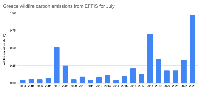
I tried to replicate the results shown in the graph below from the Copernicus CAMS reports. The European Forest Fire Information System (EFFIS) – also a Copernicus programme – publishes data on carbon dioxide (and other gas) emissions on its dashboard.
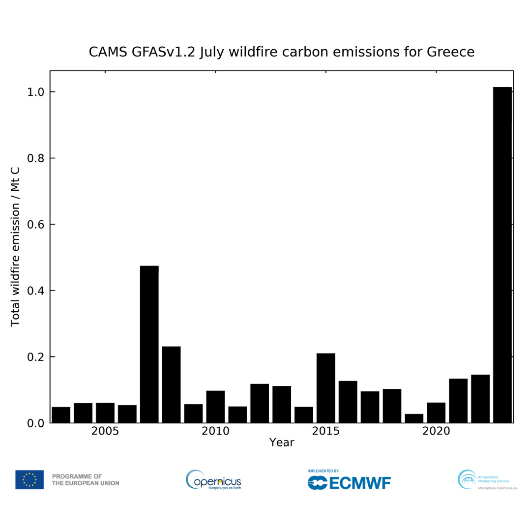
Here’s how the data from EFFIS looks. In the dashboard, it’s presented in tonnes of carbon dioxide, not just carbon, so I divided those values by 3.64 to get to tonnes of carbon.
The 2007 and 2023 comparison is the same, and many other years match. But there are some odd differences. The chart above shows very low emissions in 2018, while EFFIS shows very high emissions. The opposite is true for 2015: in the chart above its emissions are high, while they’re pretty low in the chart below.
If anyone knows where I’m going wrong then do let me know. I checked other pollutant/gas emissions data on the EFFIS dashboard for non-CO₂ (but carbon-based) emissions such as carbon monoxide, organic carbon, non-organic carbon etc. but that doesn’t solve the issue. For example, these emissions are all very high for 2018, when the chart from Copernicus CAMS above suggests that carbon should be low.
2
Turco, M., Bedia, J., Di Liberto, F., Fiorucci, P., von Hardenberg, J., Koutsias, N., Llasat, M.-C., Xystrakis, F. and Provenzale, A., 2016, 'Decreasing fires in Mediterranean Europe', PLOS One 11(3), e0150663 (https://dx.plos.org/10.1371/journal.pone.0150663) accessed September 26, 2019.
No comments:
Post a Comment